Webinar—What can visual analytics & big data do for you?

What can visual analytics & big data do for you? In this 45 minute webinar, Stephen McDaniel will review visual analytic examples and demonstrate what big data analytics can do for you. Stephen will demonstrate this using Tableau 8. Visual analytics- how is it different than traditional analytics? Review several examples and how they empower … Read more

SAS versus R for business analysts

Click to read this post

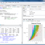
Over on R4Stats, I replied to Bob Muenchen’s article, Forecast Update: Will 2014 be the Beginning of the End for SAS and SPSS?

Personally, I think SAS is a wonderful application, with my SAS experience starting in SAS programming back in 1989 (mainframes, along with Fortran), SAS Enterprise Guide (I wrote SAS for Dummies, the first two editions with Chris Hemedinger) and SAS Enterprise Miner.   Additionally, I have used JMP, SAS Data Integration Studio, SAS Forecast Studio and several other SAS tools.

On the other hand, I have used R since 2004 on several projects and S (precursor to R) since the 90’s in biopharm. I find R truer to being a modern programming language while SAS is truer to being an analyst programming language. Perhaps I am biased? But, the way I think of attacking problems with data and my typical need to massage the data in a wide range of ways, SAS is simply superior in my opinion. The flow of the language, the ease of readability and the powerful DATA step are still my favorite programming world. However, if I am seeking most any statistical test under the sun, R is clearly superior.

Unfortunately, R doesn’t have a clear, de-facto GUI (graphical user interface) that is well-designed

Read more

Joyful or informative charts? Best practices in visual analytics

Small_packed_bubble_chartStephen Few, noted visual analytics expert and the original inspiration for our work in the field, recently wrote about criticisms of best data visualizations practices. In particular, Amanda Cox of the New York Times said, “There’s a strand of the data viz world that argues that everything could be a bar chart. That’s possibly true but also possibly a world without joy.” And Nathan Yau of Flowing Data wrote, “in visualization you eventually learn that there’s more to the process than efficient graphical perception and avoidance of all things round. Design matters, no doubt, but your understanding of the data matters much more.” These are both people who have a body of work that I admire but I am also surprised at these comments.

This discussion reminds me of a similar problem in marketing and web analytics. Generating traffic that leads to sales is good. Eventually, someone finds a way to generate traffic that leads to not many new sales, but management is misled to think this must be good since traffic leads to sales. This is similar to “look, this chart is beautiful“, but hard to interpret or understand. So, while we delivered fun graphs, minimal information is shared. This may be good for traffic, but not so much for higher sales.

I suspect that part of this recent criticism can be traced back to Stephen’s recent criticism of Tableau, “Tableau Veers from the Path“. In it, he mentions a new graph type in Tableau, packed bubble charts and contrasts them with bar charts. This is an example of the “avoidance of all things circular”. Is Stephen truly anti-joy@f16 Will an example show him to be wrong@f17 Let’s give it a try and you can judge for yourself.

Here’s a packed bubble chart example

Read more

Alteryx Inspire 2013 Tableau Talk

Download the presentation Picture This! Your Data in Tableau. Watch my big data talk here and download the example workbooks here (requires Tableau 8 to open). Attending this conference was a great experience. Based on multiple customer discussions at the conference, Alteryx is a great product for personal data integration, data enrichment and predictive analytics. … Read more

Rapid Graphs with Tableau 8 –
now on Amazon and on Freakalytics.com

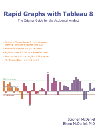
Rapid Graphs with Tableau 8
The Original Guide for the Accidental Analyst

The 8 version of this book is published in grayscale in order to meet popular demand for a lower list price versus earlier versions (5, 6 and 7) of this book series.

Rapid_Graphs_Tableau_8_Freakalytics_Copyright_346_433+ Written by Tableau insider
& former product manager, teaching
Tableau to thousands since 2009

+ Real-world examples that you
can follow include tips
and tricks to save you time

+ High-def videos & solutions

+ The fourth edition—proven & trusted

+ Buy it on Amazon

Preview the table of contents and Chapter 1 here.

Exclusive to Freakalytics, we are granting free online access to Rapid Graphs with Tableau 8!

201307_Quick_Dirty_Tableau_8_Freakalytics_027Read Chapter 2 (pages 21-39)

Build the core—Tableau basics—21
Download, install and open Tableau—22
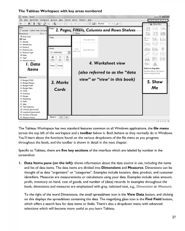
Connect to sample data and review the Tableau interface—25
“Show Me” Tableau in action—29
Categorically clear views—35

201307_Quick_Dirty_Tableau_8_Freakalytics_051Read Chapter 3 (pages 41-58)

Go with the flow—more Tableau basics-41
Save time with the Tableau toolbar-42
When tables trump graphs-44
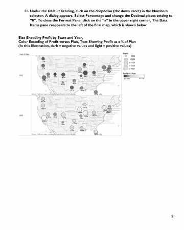
Insightful maps-48

Read more

Tableau tip- what’s smaller than a Tableau Data Extract?

While working with a client, they asked if I would show them how to analyze payment history and futures with a Gantt chart. I asked them to make a Tableau Data Extract (TDE). They created a TDE and then e-mailed it to me, all 25 Megabytes (MB)! Fairly big for an e-mail attachment (at many … Read more

Free Book Videos—Better Analytics in Tableau 8, Part 2

 
Forecasting-better-analytics-tableau-8-freakalytics-2If you display information the right way,
anybody can be an analyst.

–JOHN TUKEY
Prominent American statistician
who first used the word “software”


Part 2 Topics
      +Treemaps and packed bubble charts
      +Automatically selecting the right data for your analysis
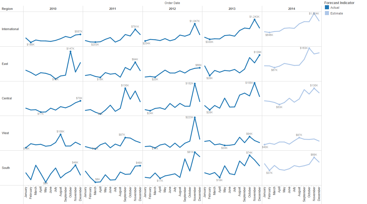
      +Forecasting for smarter planning
      +Google Analytics on the desktop—fast, beautiful and blend it with your data

The following videos are grouped by topic from our recent webinar, Better Analytics in Tableau 8. The work done in Tableau is also available for download (as a packaged workbook) below the relevant video. Tableau 8 is required to open the packaged workbooks on this page. The videos on this page are available to view in high-quality 1280×720 size, just click the four-arrow box in the bottom right of the video before clicking the play button.


Understanding relative contribution and finding extremes at a glance
Treemaps and packed bubble charts (8:43)

Download the Treemaps and packed bubble charts workbook (requires Tableau 8)


Automatically selecting the right data for your analysis
Data source filters (3:42)

Read more

Free Book Videos—Better Analytics in Tableau 8, Part 1

 
If you display information the right way,
anybody can be an analyst.

–JOHN TUKEY
Prominent American statistician
who first used the word “software”


Part 1 Topics
      +Multi-item color encoding
      +Multi-item data labels
      +Creating sets in Tableau 8
      +Union, intersection and partial sets; using sets in calculated fields

The following videos are grouped by topic from our recent webinar, Better Analytics in Tableau 8. The work done in Tableau is also available for download (as a packaged workbook) below the relevant video. Tableau 8 is required to open the packaged workbooks on this page. The videos on this page are available to view in high-quality 1280×720 size, just click the four-arrow box in the bottom right of the video before clicking the play button.


Finding data in your view
Multi-item color encoding (4:14)

Download the multi-item color encoding workbook (requires Tableau 8)


Finding data in your view
Multi-item data labels (3:04)

Read more