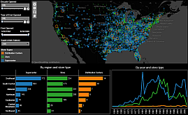
Visualizing WalMart
 |
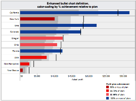
Bullet chart enhancements
 |
The Accidental Analyst
 |
| |
| |
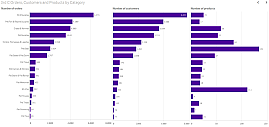
Go-to charts for business analytics
 |
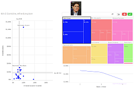
Shark Tank investments
 |
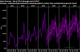
Honesty and good analytics
 |
| |
| |
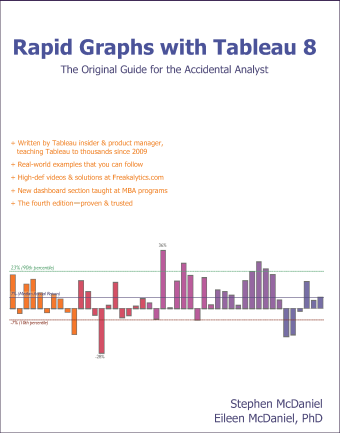
Rapid Graphs with Tableau 8
 |
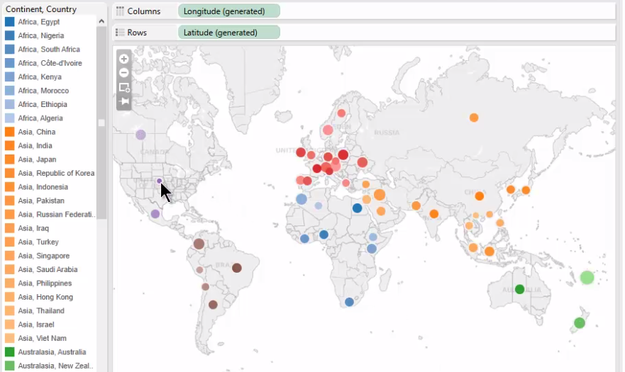
Color, labels & sets
 |
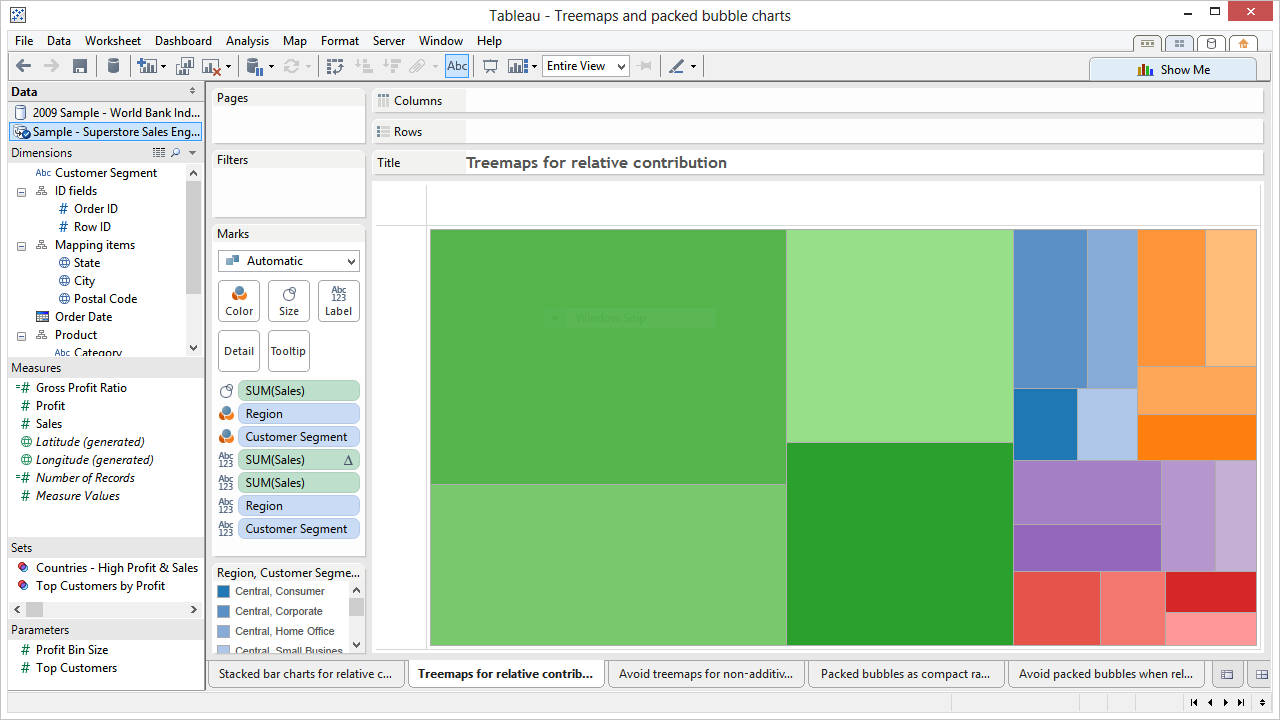
Treemaps, bubble charts & automatic filters
 |
| |
| |
SAS versus R for business analysts
 |
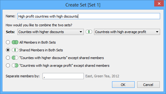
Sets for cohort analysis
Tableau 8 video & download
 |
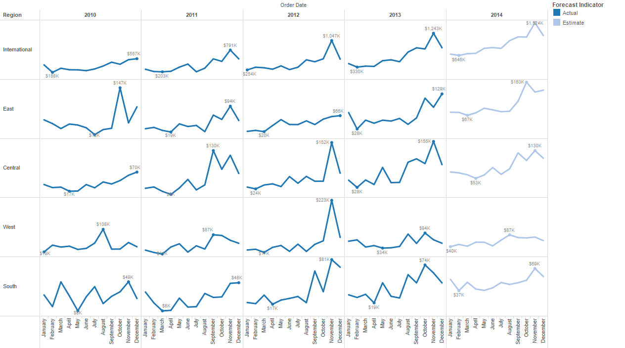
Forecasting & Google Analytics
Tableau 8 video & download
 |
| |
| |
Circle charts or bar charts?
Best practices in visual analytics
 |
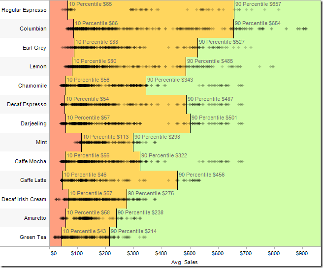
Tableau reference lines, bands & distributions tutorial
 |
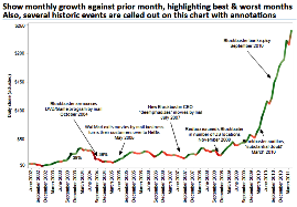
Examining data over time- Netflix stock history
 |
| |
| |
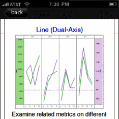
Dashboard design reference- print, Android & iPhone
 |
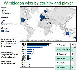
Wimbledon winners on The Guardian DataBlog
 |
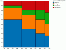
Marimekko charts and an interactive alternative
 |
| |
| |
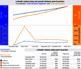
LinkedIn IPO, analysis and insights
 |
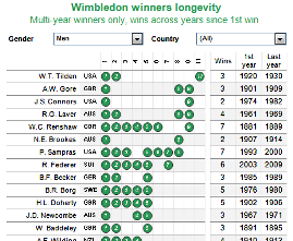
Compact dashboards- Wimbledon winners longevity
 |
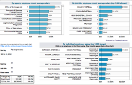
Washington state government salary dashboard
 |
|
| |
| |
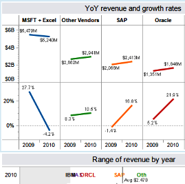
Growth of the traditional analytics vendors
 |
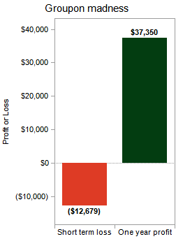
Groupon madness, estimate your profit
 |
Wimbledon winners by ranking
 |
| |
| |
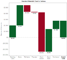
Waterfall charts in Tableau
 |
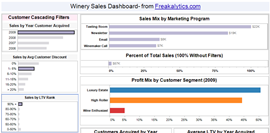
Dashboard tips by example-
bar charts as cascading filters
 |
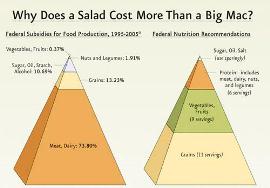
Agriculutural subsidies working
against the health of America???
 |
| |
| |
Green activities in the daily lives of Americans
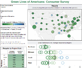 |
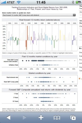
tableau public available from the iPhone
 |
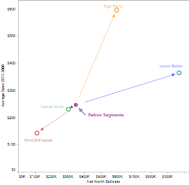
Whitepaper with Tableau, The Visual Management of Marketing Programs
 |
| |
| |
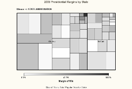
Presidential election results with SAS maps and tile charts
 |
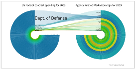
Thoughts about “Circle-Lust Continues”
 |
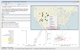
Viewing detailed tables beneath the data
with Tableau Reader
 |
| |
| |
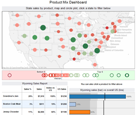
Product mix dashboard
 |
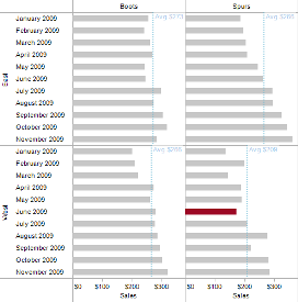
Spotlighting in Tableau using calculated fields to highlight values
 |
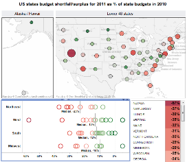
Map dashboard, state budget shortfalls for 2011
 |
| |
| |
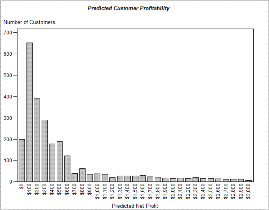
The joy of SAS Enterprise Guide
 |
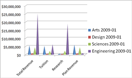
Data presentation principles
 |
Simple Dashboard Design Strategies Presentation
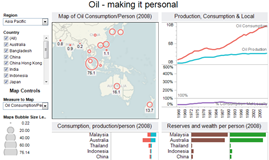
Making Oil Personal Dashboard
 |
| |
| |
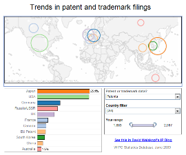
Compact dashboards
 |
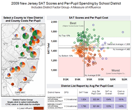
SAT performance versus school spending dashboard
 |
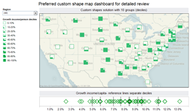
Maps to inform standard and novel approaches
 |
| |
| |
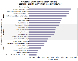
Maximizing sustainability by incorporating consumer behavior & environmental expert opinion
 |
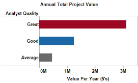
The value of a great analyst- about $3M per year!
 |
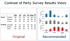
Effectively communicating survey data
 |
| |
| |
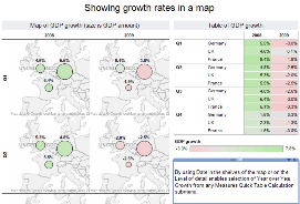
Displaying growth rates in maps
 |
Early review of Tableau 6
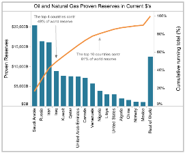 |
tableau public, Freakalytics featured at launch!
 |
| |
| |
Tableau 7 Customer Conference features overview
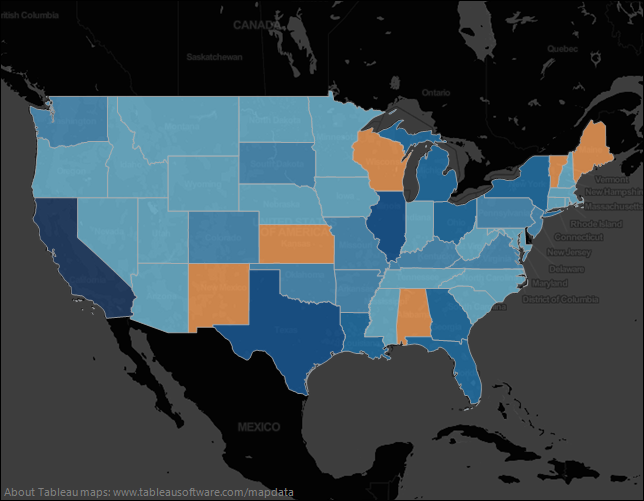 |
Bullet chart enhancements to maximize value
 |
Examining data over time- Netflix stock history
 |