Are you drowning in a sea of data? Would you like to take control of your data and analysis to quickly answer your business questions and make critical decisions? Do you want to confidently present results and solutions to your managers, colleagues, clients and the public? Are you a champion of analytics in your organization helping others learn how to analyze and make sense of their data?
If so, The Accidental Analyst: Show Your Data Who’s Boss is for you!
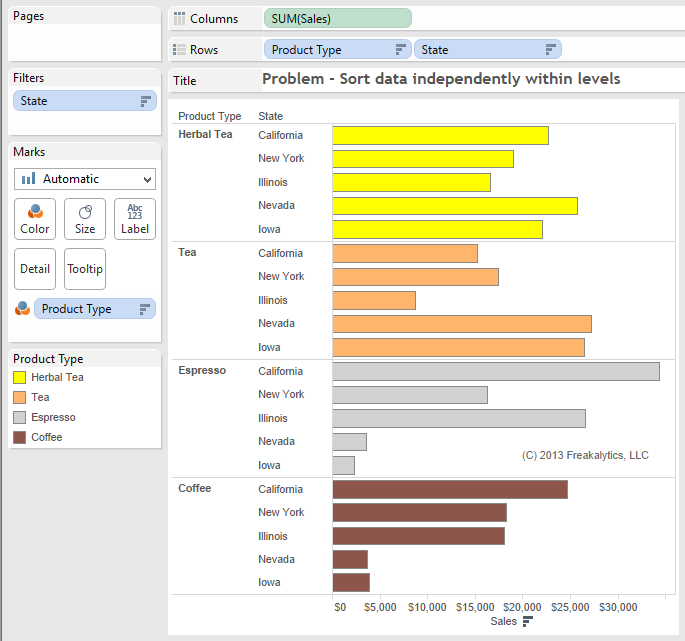
Many students have been confused about the Tableau data sort behavior. A common question is how to sort the data at a lower level correctly within each higher level of data in a view. One student recently came to us with this view and asked, “What’s up? I thought it would sort each state independently within each Product Type! In the first group, Herbal Tea, Nevada is clearly number one yet it is shown in the fourth position.”
Solution
I replied that Tableau was sorting Stateoverall across every product type once for the entire tableandthen displaying this sort order for every Product Type. She said this is “stupid, how can I fix it! I wasted hours trying to fix it already.”
Login to see the solution including a solution workbook! If you haven’t joined Freakalytics yet, it’s free and easy. Just click signup.
The 1st workbook walks you through building a standard Waterfall chart in Tableau. Waterfall charts are intended to show you how cash balances change over time based on transactions that either add to or subtract from the cash account of a business.
As this example demonstrates, many non-standard chart types can be created in Tableau using advanced features of the product. This chart type is a frequent request of students in our public and on-site Tableau training courses.
Joe Mako recently created a Tableau version of a Marimekko char inspired by an example from Jon Peltier, an Excel charting expert.
When I first saw this chart, I was curious as to the utility of this chart type for regular business decision-makers. I agree that for advanced analysts, it can offer a compact, contained means to present information across two categorical items (dimensions in Tableau) and metric (a measure in Tableau.) You can see this in the Marimekko chart created by Joe Mako in the left half of the dashboard below. When you examine the Marimekko chart you can see the dominant cities and the relative share of each segment within each city. You can also select the city names above the view to highlight a specific city. For example, you can easily discern that Almond Lovers are the biggest group of customers for this company and Delicious-n-new are the smallest group.
However, it is somewhat challenging to ascertain within Gainesville, FL which segment is the largest and smallest for this city. If you hover over each Gainesville, FL value in the original chart, you will see that two segments are identical in size; this is very hard to see without the hover values. This is due to the varying width and length dimensions for each tile in the chart.
Always leave them wanting more! –P.T. Barnum Creator of “The Greatest Show On Earth!®“ About our Presentation Length Calculator Creating compelling presentations that are clear and actionable are the lifeblood of successful analyst teams. Often, analysts have worked on problems for days or weeks and have much more material to present than is relevant or … Read more
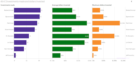
Using data from the first four seasons of the Shark Tank, Freakalytics has assembled a few fascinating insights for fans and potential entrepreneurs that may come before the Sharks in future seasons. While Barbara Corcoran is the most frequent investor. Mark Cuban is the investor with the largest amount invested and Mr. Wonderful invests the … Read more
You can have brilliant ideas, but if you can’t get them across, your ideas won’t get you anywhere. –LEE IACOCCA Engineer on the original Ford Mustang design team and CEO during Chrysler’s comeback in the 1980’s. From the Seven C’s of Data Analysis Framework Maria is a Senior Sales Analyst for an … Read more
At the Qlik World 2014 expert data visualization panel, moderated by Donald Farmer, Donald asked each panelist to offer up one of our favorite data visualizations for inspiration and learning. Alberto Cairo, Visualization at The University of Miami, offered up John Snow’s 1854 map of London that helped demonstrate that cholera was spread by contaminated … Read more
I was asked by Donald Farmer of Qlik about my favorite charts. Donald is leading a keynote panel on data visualization at Qlik’s World Conference with myself, Alberto Cairo and Kaiser Fung. While I can’t say that I have a favorite chart, I can definitely state that I often rely heavily on three chart types for much of … Read more
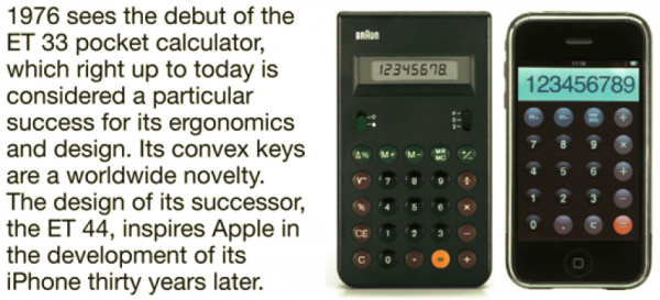
Dieter Rams is a German industrial designer most closely associated with the minimalist designs of the consumer brand Braun. Dieter was head of design at Braun for over 30 years, where he became famous for creating an austere aesthetic while focusing on user-friendliness. His philosophy is summed up in his saying, “Weniger, aber besser.” which translates into “Less, but better.” He has won many awards through the years including the World Design Medal and the Ikea Prize.
Dieter’s impact reaches beyond his retirement as he is now impacting design in the 21st century, with a company widely considered a leader in technology design, Apple, acknowledging a debt to Dieter as inspiration for many of their design decisions. The Head of Design at Apple wrote, “Rams’s work is beyond improvement… Rams’s ability to bring form to a product so that it clearly, concisely and immediately communicates its meaning is remarkable.”
From Braun, “90 years of history”
Ten principles of good design
As a prolific designer, Dieter formulated ten principles of good design. In this series of articles, I will adapt several of these principles for guidance in creating good analytics. I have selected the sixth principle of good design as the one I consider most important for good analytics.
The sixth principle of good design
6. Is honest – It does not make a product appear more innovative, powerful or valuable than it really is. It does not attempt to manipulate the consumer with promises that cannot be kept.