 Stephen Few, noted visual analytics expert and the original inspiration for our work in the field, recently wrote about criticisms of best data visualizations practices. In particular, Amanda Cox of the New York Times said, “There’s a strand of the data viz world that argues that everything could be a bar chart. That’s possibly true but also possibly a world without joy.” And Nathan Yau of Flowing Data wrote, “in visualization you eventually learn that there’s more to the process than efficient graphical perception and avoidance of all things round. Design matters, no doubt, but your understanding of the data matters much more.” These are both people who have a body of work that I admire but I am also surprised at these comments.
This discussion reminds me of a similar problem in marketing and web analytics. Generating traffic that leads to sales is good. Eventually, someone finds a way to generate traffic that leads to not many new sales, but management is misled to think this must be good since traffic leads to sales. This is similar to “look, this chart is beautiful“, but hard to interpret or understand. So, while we delivered fun graphs, minimal information is shared. This may be good for traffic, but not so much for higher sales.
I suspect that part of this recent criticism can be traced back to Stephen’s recent criticism of Tableau, “Tableau Veers from the Path“. In it, he mentions a new graph type in Tableau, packed bubble charts and contrasts them with bar charts. This is an example of the “avoidance of all things circular”. Is Stephen truly anti-joy@f16 Will an example show him to be wrong@f17 Let’s give it a try and you can judge for yourself.
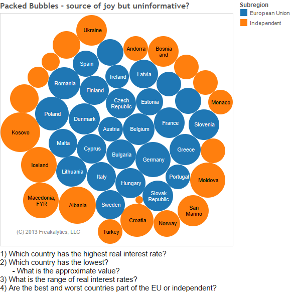
Here’s a packed bubble chart example that examines the average inflation-adjusted interest rates of European countries from 2000-2010. Countries are colored by status within the European Union. Can you easily answer the following questions? I think these are all good questions that you might expect to be asked if you presented this chart at a management meeting about this metric.
Using the packed bubble chart
1) Which country has the highest real interest rate?
2) Which country has the lowest?
– What is the approximate value?
3) What is the range of real interest rates?
4) Are the best and worst countries part of the EU or Independent?
Using the bar chart
1) Which country has the highest real interest rate?
2) Which country has the lowest?
– What is the approximate value?
3) What is the range of real interest rates?
4) Are the best and worst countries part of the EU or Independent?
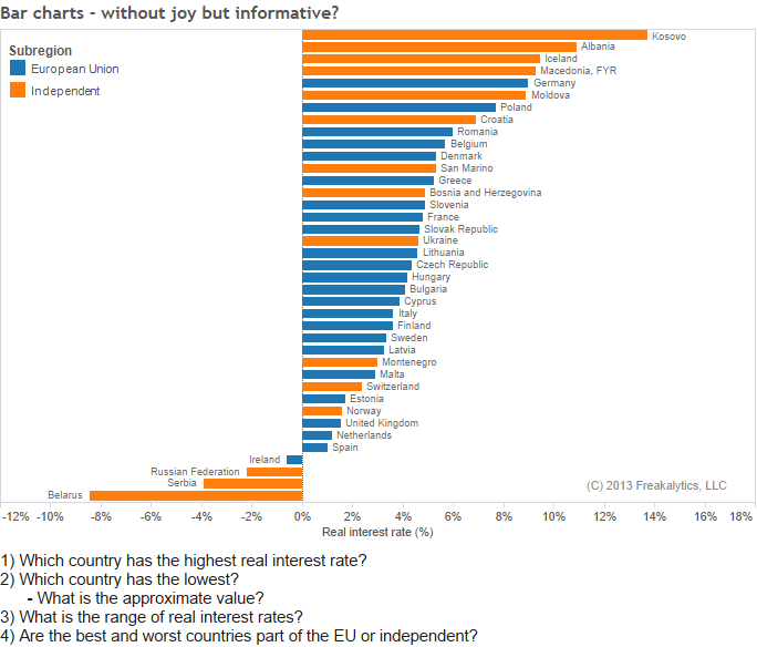
As you can see, the “joyless” bar chart is much easier to read. You can see which ones have higher rates, easily examine rank and also quickly perform relative comparisons. Additionally, you can understand that some of these countries had a negative real interest rate, quite surprising to me and not at all obvious in the packed bubble chart! Personally, I take great joy in helping people understanding the data, so I don’t understand why bar charts are joyless.
However, as an analyst, statistician and data miner at many companies, I can tell you what isn’t joyful- standing in front of a group of executives and conveying incorrect answers because they misread your “joyful chart”. How about showing a chart in a meeting and saying “as you can plainly see” when no one can see it. Having this problem across several meetings will eventually marginalize your work as an analyst since you are making points they can’t see! Most business analysts work hard to earn credibility and trust through quality analysis, clear explanations and well-reasoned recommendations. Why stack the deck against them with misguided visual analytics advice?
You can read Stephen’s original article here.
Freakalytics
This is brought to you by the leading independent Tableau training source, Freakalytics. We offer training focused on solving real-world problems with your data, Tableau and other relevant analytic tools and technologies. Please contact us if we can be of service with on-site training at Info@Freakalytics.com
Freakalytics has trained thousands in public and on-site classes around the world, including founding and authoring Tableau’s training program back in 2009, writing the first Tableau book (now in the 4th edition), teaching at multiple Tableau world and European conferences and direct leadership roles at Tableau with the founders, guiding the future of Tableau Desktop. We are also the authors of The Accidental Analyst, SAS for Dummies, The Rapid Dashboard Reference Card and have been on the faculty of The American Marketing Association and The Data Warehouse Institute.
Securely share R shiny apps
Develop R shiny apps
All on one dedicated, secure and powerful platform.