Free Webinar—Quick & dirty analysis with Tableau
in 13 lucky steps!

6_Manual_Rearrange_Items_Freakalytics_1_Tableau
July 31st, 2013, Noon Pacific, 3 PM Eastern, 8 PM London
 
 
So much data, so little time!
–Stephen McDaniel
Co-founder of Freakalytics


Synopsis
Let’s face it: in the daily world of work, you often are asked to provide an answer to a new problem in less than a day. Of course, your boss tends to forget about the other three project deadlines you are currently facing, so you really have only 10 or 20 minutes to squeeze in a quick and dirty analysis.

If this sounds familiar to you, this webinar will walk you through the thirteen flexible steps that can take you from being clueless to looking smart with Tableau in just a few minutes. Hopefully you’ll be able to obtain enough information to come up with ideas for an e-mail update or talking points for the unexpected meeting that is looming large over your day, showing your boss and colleagues that you can deliver great results in time to be useful.

So, if you’re already a user of Tableau, this webinar will guide you in the critical path of many analyses in Tableau. If you are totally new to Tableau, you can see the possibilities of what you can accomplish in a short amount of time, once you get started and practice these techniques.
 
 
A preview of the first few steps

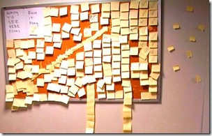
1 What question will you examine?

1_PostIts_Flickr_Sources_CC_License


Okay, in reality this step might take hours or even days! But let’s assume you have your question, and if it is complex, break it down into several, simpler questions.

2 Grab the closest, readily available dataset
Read more

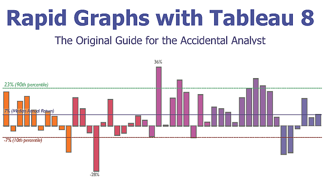
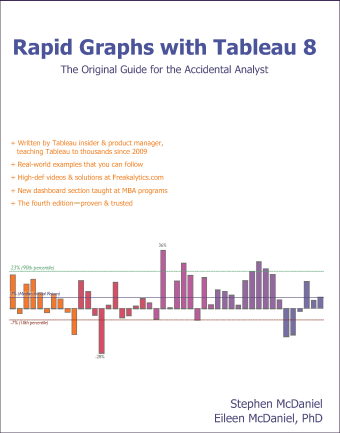
Rapid Graphs with Tableau 8—Chapter 1 & Table of Contents

The 8 version of this book is published in grayscale in order to meet popular demand for a lower list price versus earlier versions (5, 6 and 7) of this book series.

Rapid_Graphs_Tableau_8_Freakalytics_Copyright_346_433+ Written by Tableau insider
   & product manager, teaching
   Tableau to thousands since 2009

+ Real-world examples that you
   can follow include tips
   and tricks to save you time

+ High-def videos & solutions

+ The fourth edition—proven & trusted

+ Buy it on Amazon


Read more

Freakalytics Newsletter for June 2013

Thank you for your interest in our newsletter. Please share it with your colleagues that can benefit from it.   Also, Stephen is once again full-time at Freakalytics and we are excited to be back on the road, so please let us know if we can be of service!


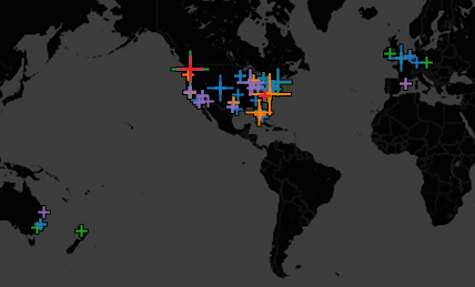
Freakalytics_Timeline_Since_2007_Map.pngFreakalytics Timeline

Since 2007, we have traveled 365,000 miles to help tens of thousands of people via

8 books,
24 conference talks,
47 public trainings,
26 on-site trainings,
5 conference seminars,
15 analytic advisory engagements
and 36 consulting projects.

Click here to download a summary of our accomplishments since 2007.


Read more

Free Webinar—Visual Analytics Best Practices
Why Can’t You See My Point?!?

201306-Freakalytics-Nuclear-Power-602

You can have brilliant ideas,
but if you can’t get them across,
your ideas won’t get you anywhere.

-Lee Iacocca


The webinar is past but you can watch the recording and view the slides below.
This post is currently being updated with the slides and videos.

Why do visual analytics best practices matter?

Why can’t people see your point when you present data-oriented presentations?

Whether you are using big data, small data or summarized data that has been prepared for you, this webinar will explore these vital questions. If you are concerned with getting the most from your data, this complimentary webinar is a great step in learning how to clearly communicate with people as they make better informed decisions in the hectic world of modern business.

Read more

Grayscale versus Color—Visual Analytics Best Practices
and Rapid Graphs with Tableau 8

black_white_bullet_300 
 
Get it right in black and white.

 
–Maureen Stone
  Leading expert on effective
  use of color in information visualization


A recent review on Amazon commented about our change in the Tableau 8 book to using grayscale images versus the prior versions using color images.   This post summarizes our thoughts on grayscale versus color usage in charts and graphs as well as the rationale for changing the book.

Thanks for taking the time to review our book.  Also, thanks for highlighting the high quality and thoroughness of the content — we are passionate about helping people analyze their data, which motivated Stephen to approach Tableau in 2008 about writing the first book on the software.

While the past few versions were indeed in color, many people asked if we could lower the list price for the launch of the 8.0 edition. We also are surprised at the high price of printing in color, especially a time-sensitive book like this one about Tableau (the software updates every 14-18 months and most publishers take 4-6 months -AFTER- the author finishes to get the books to market).  Unlike most publishers (large or small), our books sold in the U.S. are printed in the U.S., so we can publish relatively quickly after release.

Read more

Free Webinar—Better Dashboards in Tableau 8
Video and Slides Now Available

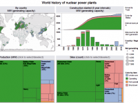
201306-Freakalytics-Nuclear-Power-602Attend this complimentary webinar for ideas and inspiration to design informative, dynamic and captivating dashboard experiences with Tableau 8.

The webinar is past but you can watch the recording, download the workbook and view the slides below.

In this complimentary webinar, Stephen will walk you through the steps to build one of the advanced dashboards that ships in Tableau 8. Stephen will be using the World Nuclear Power Plants example that he designed while Director of Analytics at Tableau. Stephen was inspired to create this example based on the work of Peter Aldhous at The New Scientist.

Click here for the rest of this post including webinar slides, video and example workbooks

Read more

Exercises and videos for Rapid Graphs with Tableau 8

RGTS8_433If you are interested in buying the book, please follow this link.

There are three sample datasets used in the Tableau 8 book that are free for anyone to use, but you must be a registered user of our site to access these downloads. Registration connects us with you so we can keep in touch with you with course schedules, book updates and other topics of interest. You may unsubscribe from the e-mail list at any time by visiting our home page and clicking on the unsubscribe link. Please note that we will never share this registration information with another company.


Read more

Joyful or informative charts? Best practices in visual analytics

Small_packed_bubble_chartStephen Few, noted visual analytics expert and the original inspiration for our work in the field, recently wrote about criticisms of best data visualizations practices. In particular, Amanda Cox of the New York Times said, “There’s a strand of the data viz world that argues that everything could be a bar chart. That’s possibly true but also possibly a world without joy.” And Nathan Yau of Flowing Data wrote, “in visualization you eventually learn that there’s more to the process than efficient graphical perception and avoidance of all things round. Design matters, no doubt, but your understanding of the data matters much more.” These are both people who have a body of work that I admire but I am also surprised at these comments.

This discussion reminds me of a similar problem in marketing and web analytics. Generating traffic that leads to sales is good. Eventually, someone finds a way to generate traffic that leads to not many new sales, but management is misled to think this must be good since traffic leads to sales. This is similar to “look, this chart is beautiful“, but hard to interpret or understand. So, while we delivered fun graphs, minimal information is shared. This may be good for traffic, but not so much for higher sales.

I suspect that part of this recent criticism can be traced back to Stephen’s recent criticism of Tableau, “Tableau Veers from the Path“. In it, he mentions a new graph type in Tableau, packed bubble charts and contrasts them with bar charts. This is an example of the “avoidance of all things circular”. Is Stephen truly anti-joy@f16 Will an example show him to be wrong@f17 Let’s give it a try and you can judge for yourself.

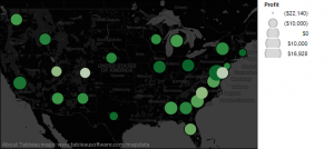
Here’s a packed bubble chart example

Read more

Alteryx Inspire 2013 Tableau Talk

Download the presentation Picture This! Your Data in Tableau. Watch my big data talk here and download the example workbooks here (requires Tableau 8 to open). Attending this conference was a great experience. Based on multiple customer discussions at the conference, Alteryx is a great product for personal data integration, data enrichment and predictive analytics. … Read more