
Get it right in black and white.
–Maureen Stone
Leading expert on effective
use of color in information visualization
A recent review on Amazon commented about our change in the Tableau 8 book to using grayscale images versus the prior versions using color images. This post summarizes our thoughts on grayscale versus color usage in charts and graphs as well as the rationale for changing the book.
Thanks for taking the time to review our book. Also, thanks for highlighting the high quality and thoroughness of the content — we are passionate about helping people analyze their data, which motivated Stephen to approach Tableau in 2008 about writing the first book on the software.
While the past few versions were indeed in color, many people asked if we could lower the list price for the launch of the 8.0 edition. We also are surprised at the high price of printing in color, especially a time-sensitive book like this one about Tableau (the software updates every 14-18 months and most publishers take 4-6 months -AFTER- the author finishes to get the books to market). Unlike most publishers (large or small), our books sold in the U.S. are printed in the U.S., so we can publish relatively quickly after release.
We invested additional time adjusting the illustrations to grayscale, and as a result, drove the release price down from $47 for the 7 book to $29 for the 8 book, a savings of $18/copy or ~ 38%. Of course, the 7 book has a lower list price now (which is normal for prior release software books), and on top of that, the exact price that Amazon selects is beyond our control.
We’ve discovered that creating charts in grayscale forces us to work carefully on reducing them to only the elements necessary to convey the information, which is a best practice in the field of visual analytics. To quote Maureen Stone, an internationally recognized expert on the effective use of color for information visualization and someone who has worked on Tableau as a color expert since Tableau 1.0, as she wrote on Stephen Few’s website:
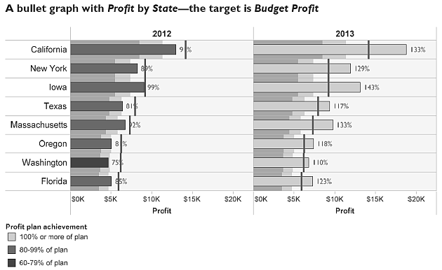
The importance of value contrast is why a primary rule in many forms of design is “get it right in black and white.” In an ideal design, all important information would be legible even if chroma were reduced to zero everywhere in the presentation, leaving only shades of gray.
Regarding “The Accidental Analyst”, executives at Tableau were impressed and excited by the unique approach, well-organized content and friendly writing style in the early drafts of the book, which we had shared with them. They had no issues with the choice of greyscale since they sponsored a pre-publication run of the book, giving a copy to every attendee of the Tableau Customer Conference in October 2011.
Finally, we also appreciate color! If color is critical, please visit our web site, Freakalytics.com to watch the 8 companion training videos about Better Analytics with Tableau 8 and check out our many examples on the Gallery page. Also, examine the Samples that are included on the home screen of Tableau 8. Stephen created or worked on every one of them in conjunction with Chris Stolte, Christian Chabot, Jock MacKinlay and other colleagues at Tableau.
As the only independent Tableau training source, we want to help as many people as possible learn how to effectively analyze their data. We hope you now better understand our choices. Thanks for allowing us to help you become a better analyst with Tableau!
Securely share R shiny apps
Develop R shiny apps
All on one dedicated, secure and powerful platform.