Balancing analysis of multiple years by filtering through the same month/day as today
 Topics in this example
1) With a line chart, by placing Year(Order Date) on the Color shelf and Month(Date) on the columns, you can easily compare multiple years on the same pane of the graph. Just use Running Totals from the Quick Table Calculation dialog.
2) If this were real-world data, you would likely want to keep data through today; otherwise, prior years would likely be much higher since they are based on a full month while this year’s latest month is partially complete, unless it is the last day of the month!
3) By creating a calculated field that can check if the month/day is before today’s month/day and placing it on the filter shelf and selecting True, you can keep year-to-date data
Analytics
Freakalytics Newsletter, May 2012
Thank you for your interest in our newsletter. Please share it with your colleagues and friends that you think can benefit from it. We are happy to share some great news, Eileen is close to the final release of our upcoming book, “The Accidental Analyst“! Look for training opportunities around the Accidental Analysts soon! Also, … Read more
Create data-driven groups in Tableau with data blending (VLookup)
Similar to VLookup functionality in Excel, you can use a second data source to dynamically create a new group in a separate Tableau data source. Just follow along with this example to create one.
1. Open the Tableau included sample data source, Sample – Superstore Sales (Excel)

2. Map Sales by State: CTRL-Click on State and then on Sales. Click Show Me and select Symbol Maps. A map will appear.

3. Suppose you would like to label each state by region and/or filter by region. If you already have a text file, Excel spreadsheet or database table with region data, you can use this for an Excel VLookup type of functionality. The example
Tableau customer profile, Eystein from Norway, Banking & Insurance

Customer
Eystein from Norway
Favorite quote speaking with him
“Make it simple and fast, my IT team was cheering on Tableau after trying it and QlikView. They really hoped we would pick Tableau and I am very happy we did.”
Situation
Eystein recently took over a BI team that wanted to accelerate use of data across every area of the bank and subsidiaries. The bank and subsidiaries are heavy users of SAS Enterprise Guide, SAS Web Report Studio and SAS Enterprise Miner.
They have a variety of data sources and data marts throughout the business. There is also a centralized Enterprise Data Warehouse (EDW) effort that is making headway, but has a long list of items ahead of them. In the meantime, SAS users are rapidly creating new data pulls that Eystein would like to use in Tableau. He realizes that the EDW team will never be able to have all the data that is needed by the business, so SAS is a good platform to prep the data for widespread analysis in Tableau.
Status
They recently evaluated fast analytic tools from
Quick and dirty analysis with Tableau 6
(in thirteen lucky steps)
 Let’s face it: in the daily world of work, you often are asked to provide an answer to a new problem in less than a day. Of course, your boss tends to forget about the other three project deadlines you are currently facing, so you really have only 10 or 20 minutes to squeeze in a quick and dirty analysis.
If this sounds familiar to you, this cheat sheet includes thirteen flexible steps that can take you from being clueless to looking smart in just a few minutes, with a little help from Tableau. Hopefully you’ll be able to obtain enough information to come up with ideas for an e-mail update or talking points for the unexpected meeting that is looming large over your day, showing your boss and colleagues that you can deliver great results in time to be useful.
So, if you’re already a user of Tableau, this cheat sheet will guide you to do the analysis. Even if you are totally new to Tableau, you can see the possibilities of what you can accomplish in a short amount of time, once you get started.
Download a printer-friendly version of this article here.
1 What question will you examine?

Okay, in reality this step might take hours or even days! But let’s assume you have your question, and if it is complex, break it down into several, simpler questions.
2 Grab the closest, readily available dataset that is relevant
Why choose Complete Tableau Training by Freakalytics?
A recent attendee’s perspective
This review of our 4 day training series was written on LinkedIn by a recent public training attendee, Danyelle. She works at the US Department of Health and Human Services as a Senior Data Advisor. I had the great pleasure of speaking with her outside of the class and was fascinated to hear how … Read more
Quick tutorial on reference lines, bands and distributions – visual analytics best practices
The following article features Tableau 6 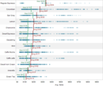
Reference lines, bands or distributions may be added to your views to emphasize particular values or areas that may be useful in interpreting your data. In particular, when comparing multiple groups or categories of data, reference lines and bands provide immediate feedback on the overall differences between the groups.
Reference lines
Reference lines are vertical or horizontal lines displayed on your view that mark requested values such as average, median, minimum, maximum, sum, total and constants (such as a line that separates the data points as being above or below a target). They can be added on any continuous axis.
1) Open the Sample – Coffee Chain (Access) data source included by default with Tableau 6
2) Place Sales on the Columns shelf and change the aggregate to Average.
3) Place Product on the Rows shelf,
State and Date on the Level of Detail shelf
and format Date to ‘MMMM YYYY’.
The Seven Developers of Tableau 7 – Tableau Customer Conference 2011
Chris Stolte, Chief Development Officer at Tableau introduced
Six senior developers on stage for a preview of Tableau 7.
Chris Stolte
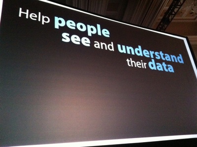
Tableau’s mission is help people see and understand their data.
How much simpler can it get@f26
Tableau was started while
Tableau 6 – how it can change your world
The following article features Tableau 6
Whether you are exploring your data for new insights, answering specific questions or even deciding what questions to ask, Tableau gives you unprecedented control to investigate, communicate and take action with the valuable information hidden in your data! Tableau has it all – a wide variety of options to graph your data, the ability to adjust your data so that you are using the right data in the right form for the questions at hand, and a user-friendly interface that’s designed around how people think about analysis, allowing you to follow your thoughts as you question and explore your data. You can work with every major data source, from Excel workbooks to the largest databases. You can even extract data from larger sources into a local “extract” file that will make your data exploration more efficient and allow offline analysis when you are away from the office.
Profit and planned profit by product
Red is below plan, green is above
Percentage is actual versus plan
Black line in 2010 shows prior year profit amount

Displaying profit versus sales by region and customer segment Average profit ratio = size of bubble;
Minimum and maximum percents labeled per region
Colors are customer segments
State of Washington government salaries from 2010, search all 160,000 employees
State of Washington government salary information is now available at WashingtonGovernmentSalaries.com. The dashboard is fully searchable by agency, job title and employee using a dashboard developed by Freakalytics and hosted by Tableau Public. Both companies are based in Seattle, Washington. Freakalytics specializes in expert, in-person analytics training and popular books on analytics. Tableau is a … Read more