Free Webinar—Better Dashboards in Tableau 8
Video and Slides Now Available

201306-Freakalytics-Nuclear-Power-602Attend this complimentary webinar for ideas and inspiration to design informative, dynamic and captivating dashboard experiences with Tableau 8.

The webinar is past but you can watch the recording, download the workbook and view the slides below.

In this complimentary webinar, Stephen will walk you through the steps to build one of the advanced dashboards that ships in Tableau 8. Stephen will be using the World Nuclear Power Plants example that he designed while Director of Analytics at Tableau. Stephen was inspired to create this example based on the work of Peter Aldhous at The New Scientist.

Click here for the rest of this post including webinar slides, video and example workbooks

Read more

Exercises and videos for Rapid Graphs with Tableau 8

RGTS8_433If you are interested in buying the book, please follow this link.

There are three sample datasets used in the Tableau 8 book that are free for anyone to use, but you must be a registered user of our site to access these downloads. Registration connects us with you so we can keep in touch with you with course schedules, book updates and other topics of interest. You may unsubscribe from the e-mail list at any time by visiting our home page and clicking on the unsubscribe link. Please note that we will never share this registration information with another company.


Read more

Rapid Graphs with Tableau 8 –
now on Amazon and on Freakalytics.com

Rapid Graphs with Tableau 8
The Original Guide for the Accidental Analyst

The 8 version of this book is published in grayscale in order to meet popular demand for a lower list price versus earlier versions (5, 6 and 7) of this book series.

Rapid_Graphs_Tableau_8_Freakalytics_Copyright_346_433+ Written by Tableau insider
& former product manager, teaching
Tableau to thousands since 2009

+ Real-world examples that you
can follow include tips
and tricks to save you time

+ High-def videos & solutions

+ The fourth edition—proven & trusted

+ Buy it on Amazon

Preview the table of contents and Chapter 1 here.

Exclusive to Freakalytics, we are granting free online access to Rapid Graphs with Tableau 8!

201307_Quick_Dirty_Tableau_8_Freakalytics_027Read Chapter 2 (pages 21-39)

Build the core—Tableau basics—21
Download, install and open Tableau—22
Connect to sample data and review the Tableau interface—25
“Show Me” Tableau in action—29
Categorically clear views—35

201307_Quick_Dirty_Tableau_8_Freakalytics_051Read Chapter 3 (pages 41-58)

Go with the flow—more Tableau basics-41
Save time with the Tableau toolbar-42
When tables trump graphs-44
Insightful maps-48

Read more

Free Book Videos—Better Analytics in Tableau 8, Part 2

 
Forecasting-better-analytics-tableau-8-freakalytics-2If you display information the right way,
anybody can be an analyst.

–JOHN TUKEY
Prominent American statistician
who first used the word “software”


Part 2 Topics
      +Treemaps and packed bubble charts
      +Automatically selecting the right data for your analysis
      +Forecasting for smarter planning
      +Google Analytics on the desktop—fast, beautiful and blend it with your data

The following videos are grouped by topic from our recent webinar, Better Analytics in Tableau 8. The work done in Tableau is also available for download (as a packaged workbook) below the relevant video. Tableau 8 is required to open the packaged workbooks on this page. The videos on this page are available to view in high-quality 1280×720 size, just click the four-arrow box in the bottom right of the video before clicking the play button.


Understanding relative contribution and finding extremes at a glance
Treemaps and packed bubble charts (8:43)

Download the Treemaps and packed bubble charts workbook (requires Tableau 8)


Automatically selecting the right data for your analysis
Data source filters (3:42)

Read more

Free Book Videos—Better Analytics in Tableau 8, Part 1

 
If you display information the right way,
anybody can be an analyst.

–JOHN TUKEY
Prominent American statistician
who first used the word “software”


Part 1 Topics
      +Multi-item color encoding
      +Multi-item data labels
      +Creating sets in Tableau 8
      +Union, intersection and partial sets; using sets in calculated fields

The following videos are grouped by topic from our recent webinar, Better Analytics in Tableau 8. The work done in Tableau is also available for download (as a packaged workbook) below the relevant video. Tableau 8 is required to open the packaged workbooks on this page. The videos on this page are available to view in high-quality 1280×720 size, just click the four-arrow box in the bottom right of the video before clicking the play button.


Finding data in your view
Multi-item color encoding (4:14)

Download the multi-item color encoding workbook (requires Tableau 8)


Finding data in your view
Multi-item data labels (3:04)

Read more

Estimating future success rates from initial experience
surveys and observation (tutorial)

A wide range of common business questions are often decided incorrectly because decision-makers overlook, forget or neglect the application of a simple concept from statistics. In this tutorial we will walk you through several examples to avoid this potentially costly mistake. Examples where this technique can help include:

Is my ad worth the price?
Conversion (CTR): how many customers converted to a paying customer after clicking on an Google ad and visiting a special offer web page? Based on the revenue generated is the ad price too high?

How many of my customers have children?
Estimating customer demographics: based on a one day survey in every store, what percent of our entire customer base have children?

Who will win the election?
Survey results: what percent of likely voters will vote for Obama based on the responses from a 1,000 people in a poll?

Bringing down the house?
Winning a bet: if my friend flips a coin 10 times and it landed on heads 9 times, is this a “fair” coin?

All of these questions and many others can be answered with the technique explained and demonstrated in this article.


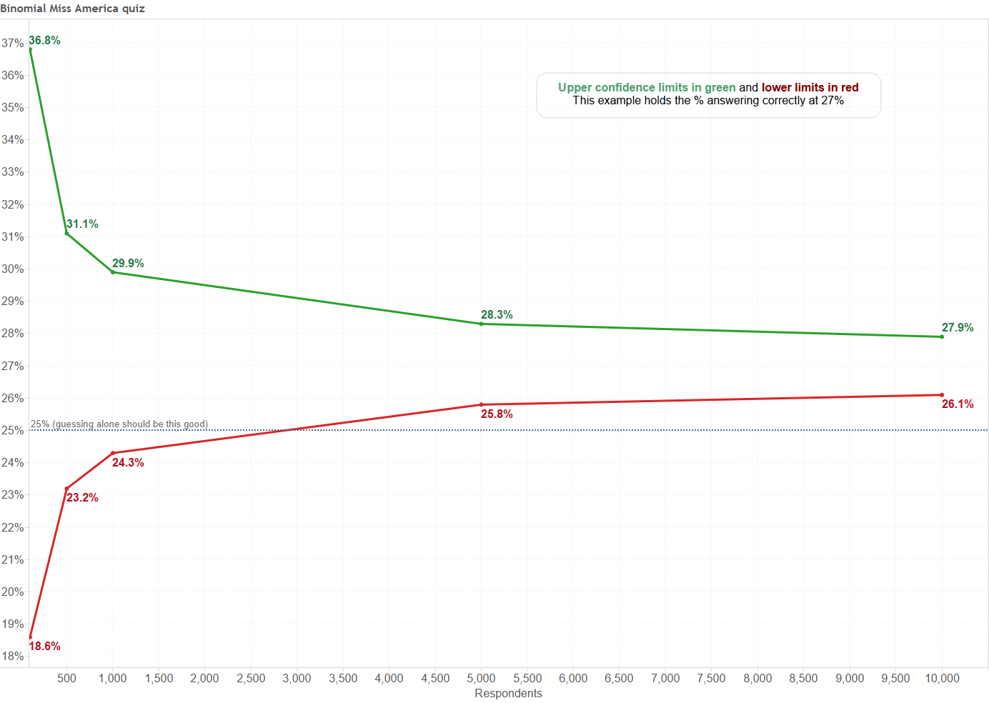
Which states have the most Miss America winners?

Here is a fun example about the Miss America pageant, it appeared on the Ask.com home page.

Notice that 27% of Ask.com users picked the correct state for the most Miss America winners, is that good? Well, we should ask how you would perform if you had no information and simply guessed at the answer. With four choices and only one correct answer, you have a 1 in 4 chance (that’s 1/4 = 25%) of guessing the answer even if you have no clue.

So, is 27% actually better than all of these people just guessing@f4 The answer is “it depends” on a missing piece of information- how many people answered this question. If 100 people answered it and 27 answered correctly, there is a good chance that they are all simply guessing. However, if 10,000 answered this question and 2,700 answered it correctly, there is a good chance that some of them answered better than just guessing.


The classic illustration of success- flip a coin

You may be puzzled at this point. Don’t fear. Let me move to a simpler example, flipping a coin. Believe it or not, it is very similar to the multiple choice question above, with the main difference being the chance of “success”- guessing heads or tails correctly, which is 1 in 2 or 50%. So, if I flip it once and you are right, then 100% of flips were guessed correctly. However, this one flip being guessed correctly wouldn’t lead me to believe that you had the ability to see the future (or that the coin is an unfair coin that is always heads). How many flips guessed correctly would it take@f5 Like I have seen followed in many business situations, what does your intuition or gut say@f6

Five out of five correct@f7
Twelve out of fourteen@f8
80 out of 100@f9

Here’s the good news, there is a simple

Read more

Relative date filters in Tableau dashboards

relative-date-filter
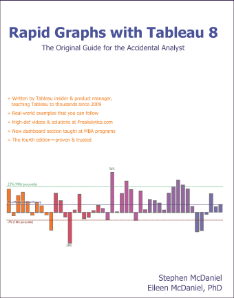
Using relative date filters in Tableau dashboards are a great way to keep your dashboard up-to-date with minimal effort. They also provide the consumer with great control if you display the relative date filter as a quick filter on the dashboard, since they enable extensive customization to the time period displayed.
 
In this dashboard, the current and prior year are displayed. By interacting with the quick filter, you could easily adjust this to one year, two quarters or even two months of data. Give it a try.

Read more

Webcast: “Big Data” on your laptop, fast, informative and at your command

NOTE: This fun review of “big data” was inspired by a recent presentation I gave on behalf of Tableau Software at the Big Data Conference in Chicago. You can find the 1st part of this 3 part webcast here, “Performance to Cost Index & my personal history with “Big Data” and Part 2 here, “Big Data” in US History, Exploring the 1790 US Census. This part of the big data series is free, just subscribe or sign in below.

In this presentation, I share an example of working with big data stored on my laptop and the entire analysis happens without any type of connection to remote servers or databases. My analysis uses two tables of interest, the first has 216 million records, over ten years of airline ticket pricing in the US while the second table has 72 million records of US airlines performance data extracted from Hadoop. In the demonstration, which uses currently available technologies, we will quickly explore and analyze this data for interesting trends and patterns.

Read more

History of US House representation from 1910 through 2010

A few observations from this example
 
Examining this dashboard with the initial decades of 1960 and 2010, you can see that the control of the House has shifted toward the West and the South. Exceptions include Louisiana, Mississippi and Oklahoma in the South and Montana in the West.
 
If you adjust the first decade slider to 1910, an even more dramatic pattern appears! People love the sunshine and the West coast with California, Florida and Nevada growth at 300%+ and Washington, Oregon, Utah and Colorado at 67% or more growth.
 
 
Dashboard topics in this example
 
Download the workbook to peek at a few cool features of this dashboard, including:
1) Using table calculations

Read more

Avoid flatline charts—visual analytics best practices

Balancing analysis of multiple years by filtering through the same month/day as today
 
 
Topics in this example
 
1) With a line chart, by placing Year(Order Date) on the Color shelf and Month(Date) on the columns, you can easily compare multiple years on the same pane of the graph. Just use Running Totals from the Quick Table Calculation dialog.
 
2) If this were real-world data, you would likely want to keep data through today; otherwise, prior years would likely be much higher since they are based on a full month while this year’s latest month is partially complete, unless it is the last day of the month!
 
3) By creating a calculated field that can check if the month/day is before today’s month/day and placing it on the filter shelf and selecting True, you can keep year-to-date data

Read more