[utcw title=” ” order=”count” tag_spacing=72 max=100 size_from=12]
Free Webcast: Performance to Cost Index & my personal history with “Big Data”
NOTE: This fun review of “big data” was inspired by a recent presentation I gave on behalf of Tableau Software at the Big Data Conference in Chicago. You can find the 2nd part of this 3 part webcast here, ““Big Data” in US History, Exploring the 1790 US Census”. Part 3 is here, “Big Data” on your laptop, fast, informative and at your command.
Many people ask me, what is “big data”? For most of them, the right answer is that big data is any data that is difficult to use or understand (yes, I know the official, “correct” answers, which often vary and typically include topics like Hadoop and Cloudera.)
In this presentation, I share my experience with the Commodore 64, the PS/2, DEC Stations, VAX servers, Solaris Servers, PC’s and a MacBook Pro. Products and languages covered include BASIC, FORTRAN, SAS, Oracle, Teradata and Tableau.
It is truly astonishing
History of US House representation from 1910 through 2010
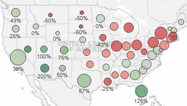 A few observations from this example
Examining this dashboard with the initial decades of 1960 and 2010, you can see that the control of the House has shifted toward the West and the South. Exceptions include Louisiana, Mississippi and Oklahoma in the South and Montana in the West.
If you adjust the first decade slider to 1910, an even more dramatic pattern appears! People love the sunshine and the West coast with California, Florida and Nevada growth at 300%+ and Washington, Oregon, Utah and Colorado at 67% or more growth.
Dashboard topics in this example
Download the workbook to peek at a few cool features of this dashboard, including:
1) Using table calculations
Avoid flatline charts—visual analytics best practices
Balancing analysis of multiple years by filtering through the same month/day as today
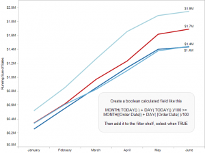 Topics in this example
1) With a line chart, by placing Year(Order Date) on the Color shelf and Month(Date) on the columns, you can easily compare multiple years on the same pane of the graph. Just use Running Totals from the Quick Table Calculation dialog.
2) If this were real-world data, you would likely want to keep data through today; otherwise, prior years would likely be much higher since they are based on a full month while this year’s latest month is partially complete, unless it is the last day of the month!
3) By creating a calculated field that can check if the month/day is before today’s month/day and placing it on the filter shelf and selecting True, you can keep year-to-date data
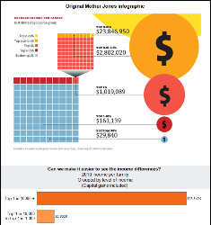
Bringing clarity out of an infographic, “Income Inequality in the US” from Mother Jones
A colleague shared this Mother Jones infographic, which attempts to explain the disparity in income between richer and poorer families in the US. The data is indeed fascinating, but quite difficult to read in their flashy infographic.
There are two major issues that hinder understanding when viewing this infographic:
1) Using areas of circles to encode the incomes is very difficult for most people to interpret. Additionally, with the difference in income being so large, it is nearly impossible to fit this on a normally sized web page. The largest group, the yellow circle, is mostly cut off in their infographic.
2) The infographic is overloaded
Freakalytics Newsletter, May 2012
Thank you for your interest in our newsletter. Please share it with your colleagues and friends that you think can benefit from it. We are happy to share some great news, Eileen is close to the final release of our upcoming book, “The Accidental Analyst“! Look for training opportunities around the Accidental Analysts soon! Also, … Read more
Create data-driven groups in Tableau with data blending (VLookup)
Similar to VLookup functionality in Excel, you can use a second data source to dynamically create a new group in a separate Tableau data source. Just follow along with this example to create one.
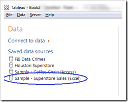
1. Open the Tableau included sample data source, Sample – Superstore Sales (Excel)
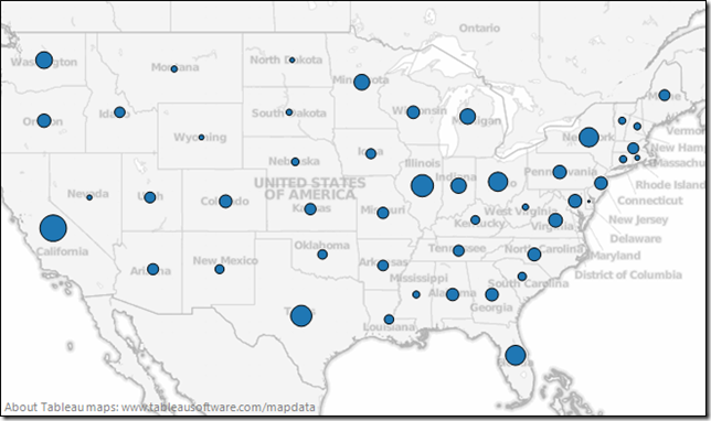
2. Map Sales by State: CTRL-Click on State and then on Sales. Click Show Me and select Symbol Maps. A map will appear.
3. Suppose you would like to label each state by region and/or filter by region. If you already have a text file, Excel spreadsheet or database table with region data, you can use this for an Excel VLookup type of functionality. The example
Data for examples in Rapid Graphs with Tableau Software 7 book
If you are looking for how to buy the book, please follow this link.
 There are three sample datasets used in the Tableau 7 book that are free for anyone to use, but you must be a registered user of our site to access these downloads. Registration connects us with you so we can e-mail you 2-3 times per year with course schedules, book updates and other topics of interest. You may unsubscribe from the e-mail list at anytime by visiting our home page and clicking on the unsubscribe link. Please note that we will never share this registration information with another company.
Rapid Graphs with Tableau Software 7 now available on Amazon, Kindle and Nook

Buy the Kindle version at Amazon, just $9.97! (free preview)
Buy Nook book at Barnes & Noble, just $9.97! (free preview)
Buy the print version at Amazon US, UK, Germany,
France or Spain (only in English, regardless of source country)
International shipping alternative to Amazon
Still using Tableau 6? Yes! You can buy the 6 version!
Tired of boring spreadsheets and data overload from confusing graphs? Master the art of rapid graphs with Tableau! Tableau is designed with one goal in mind, to give you the power to quickly explore and understand your data so that you can make informed decisions in a wide variety of real-world situations. After learning Tableau, you will be able to communicate your findings with audience-friendly graphs and tables.
“A picture is worth a thousand words” is a common saying that is more relevant today
Tableau customer profile, Eystein from Norway, Banking & Insurance
Customer
Eystein from Norway
Favorite quote speaking with him
“Make it simple and fast, my IT team was cheering on Tableau after trying it and QlikView. They really hoped we would pick Tableau and I am very happy we did.”
Situation
Eystein recently took over a BI team that wanted to accelerate use of data across every area of the bank and subsidiaries. The bank and subsidiaries are heavy users of SAS Enterprise Guide, SAS Web Report Studio and SAS Enterprise Miner.
They have a variety of data sources and data marts throughout the business. There is also a centralized Enterprise Data Warehouse (EDW) effort that is making headway, but has a long list of items ahead of them. In the meantime, SAS users are rapidly creating new data pulls that Eystein would like to use in Tableau. He realizes that the EDW team will never be able to have all the data that is needed by the business, so SAS is a good platform to prep the data for widespread analysis in Tableau.
Status
They recently evaluated fast analytic tools from
