Book Excerpt: Tableau 7 Quick Table Calculations and Custom Table Calculations

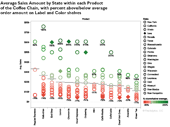
This is a free preview from Rapid Graphs with Tableau Software 7, available in print and Kindle on Amazon and on the Nook at Barnes and Noble. Due to width constraints on this blog, you may notice some loss in resolution compared with the purchased book, which has approximately 2.5 times better resolution.


Read more

Freakalytics newsletter, August 2012

Thank you for your interest in our newsletter. Please share it with your colleagues that can benefit from it. We are happy to share some great news, “The Accidental Analyst” is now available on Amazon in the US and Europe! We will be offering 90 minute book workshops around the country and a one-day course … Read more

Webcast: “Big Data” on your laptop, fast, informative and at your command

NOTE: This fun review of “big data” was inspired by a recent presentation I gave on behalf of Tableau Software at the Big Data Conference in Chicago. You can find the 1st part of this 3 part webcast here, “Performance to Cost Index & my personal history with “Big Data” and Part 2 here, “Big Data” in US History, Exploring the 1790 US Census. This part of the big data series is free, just subscribe or sign in below.

In this presentation, I share an example of working with big data stored on my laptop and the entire analysis happens without any type of connection to remote servers or databases. My analysis uses two tables of interest, the first has 216 million records, over ten years of airline ticket pricing in the US while the second table has 72 million records of US airlines performance data extracted from Hadoop. In the demonstration, which uses currently available technologies, we will quickly explore and analyze this data for interesting trends and patterns.

Read more

Avoid flatline charts—visual analytics best practices

Balancing analysis of multiple years by filtering through the same month/day as today
 
 
Topics in this example
 
1) With a line chart, by placing Year(Order Date) on the Color shelf and Month(Date) on the columns, you can easily compare multiple years on the same pane of the graph. Just use Running Totals from the Quick Table Calculation dialog.
 
2) If this were real-world data, you would likely want to keep data through today; otherwise, prior years would likely be much higher since they are based on a full month while this year’s latest month is partially complete, unless it is the last day of the month!
 
3) By creating a calculated field that can check if the month/day is before today’s month/day and placing it on the filter shelf and selecting True, you can keep year-to-date data

Read more

Quick and dirty analysis with Tableau 6
(in thirteen lucky steps)

6_Manual_Rearrange_Items_Freakalytics_1_TableauLet’s face it: in the daily world of work, you often are asked to provide an answer to a new problem in less than a day. Of course, your boss tends to forget about the other three project deadlines you are currently facing, so you really have only 10 or 20 minutes to squeeze in a quick and dirty analysis. 

If this sounds familiar to you, this cheat sheet includes thirteen flexible steps that can take you from being clueless to looking smart in just a few minutes, with a little help from Tableau. Hopefully you’ll be able to obtain enough information to come up with ideas for an e-mail update or talking points for the unexpected meeting that is looming large over your day, showing your boss and colleagues that you can deliver great results in time to be useful. 

So, if you’re already a user of Tableau, this cheat sheet will guide you to do the analysis. Even if you are totally new to Tableau, you can see the possibilities of what you can accomplish in a short amount of time, once you get started.

Download a printer-friendly version of this article here.

1 What question will you examine?

1_PostIts_Flickr_Sources_CC_License


Okay, in reality this step might take hours or even days! But let’s assume you have your question, and if it is complex, break it down into several, simpler questions.

2 Grab the closest, readily available dataset that is relevant

Read more

Why choose Complete Tableau Training by Freakalytics?
A recent attendee’s perspective

  This review of our 4 day training series was written on LinkedIn by a recent public training attendee, Danyelle.  She works at the US Department of Health and Human Services as a Senior Data Advisor.  I had the great pleasure of speaking with her  outside of the class and was fascinated to hear how … Read more

Quick tutorial on reference lines, bands and distributions – visual analytics best practices

The following article features Tableau 6

Reference lines, bands or distributions may be added to your views to emphasize particular values or areas that may be useful in interpreting your data. In particular, when comparing multiple groups or categories of data, reference lines and bands provide immediate feedback on the overall differences between the groups.

Reference lines

Reference lines are vertical or horizontal lines displayed on your view that mark requested values such as average, median, minimum, maximum, sum, total and constants (such as a line that separates the data points as being above or below a target). They can be added on any continuous axis.

1) Open the Sample – Coffee Chain (Access) data source included by default with Tableau 6

2) Place Sales on the Columns shelf and change the aggregate to Average.

3) Place Product on the Rows shelf,
     State and Date on the Level of Detail shelf
     and format
Date to ‘MMMM YYYY’.

Read more

Tableau 6 – how it can change your world

The following article features Tableau 6

Power

Whether you are exploring your data for new insights, answering specific questions or even deciding what questions to ask, Tableau gives you unprecedented control to investigate, communicate and take action with the valuable information hidden in your data! Tableau has it all – a wide variety of options to graph your data, the ability to adjust your data so that you are using the right data in the right form for the questions at hand, and a user-friendly interface that’s designed around how people think about analysis, allowing you to follow your thoughts as you question and explore your data. You can work with every major data source, from Excel workbooks to the largest databases. You can even extract data from larger sources into a local “extract” file that will make your data exploration more efficient and allow offline analysis when you are away from the office.

Profit and planned profit by product
Red is below plan, green is above
Percentage is actual versus plan
Black line in 2010 shows prior year profit amount

clip_image002

Displaying profit versus sales by region and customer segment Average profit ratio = size of bubble;
Minimum and maximum percents labeled per region
Colors are customer segments

Read more