It is fascinating how much information you can uncover with just a few years of price data using visual analytics. In this example, we use just two data items, date and closing stock price, to examine the history of Netflix as an investment (NASDAQ NFLX.)
Freakalytics
LinkedIn (NYSE symbol LNKD) IPO, analysis & insights from their SEC filing and estimates

LinkedIn, undervalued and underloved?
After examination of the data against peers, I believe LinkedIn is priced for great growth potential in the coming years. Don’t get me wrong, it’s an IPO and they can be very volatile. However, I prefer to make my investments in companies based on long-term outlook rather than speculate on short-term trading gains.
It is estimated that LinkedIn (NYSE: LNKD) will price at $42-$45 per share tomorrow, valuing the company at $4.1B which implies approximately 94.5M shares in float. Based on revenue over the past 4 quarters, this values LinkedIn at 14.1 times revenue (Price/Sales).
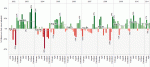
The growth of the traditional analytics vendors, 2008-2010 (Gartner and other data sources)
 Growth rate
Winners- Microsoft, Oracle and IBM
Laggards- SAP and SAS
Market share
Winners- SAP, Oracle and SAS
Laggards- IBM and Microsoft
Growth combined with market share (using three-year ranks)
Winners- Oracle, SAP and Microsoft tied at 2nd
Laggards- IBM and SAS
From the recent Gartner press release, “There was little change year-on-year in terms of vendor rankings. SAP remained the No. 1 vendor in combined worldwide BI, analytics and PM software revenue in 2010, accounting for 23 percent of the market (see Table 1), followed by Oracle, SAS Institute, IBM and Microsoft.” I find this fairly interesting since the vast majority of companies I work with all cite Excel as the most frequently used analytics tool, by a long-shot. For more details on this thought, please review our second analysis that includes Excel in the “Analytics” market.
 |
 |
Without further delay, here is a dashboard summarizing the results, we have added data from 2008 for additional context and insight.
Quick reference for graph and dashboard design
Freakalytics has published a quick reference for building better graphs and dashboards. The Rapid Dashboards Reference Card has 64 tips readily available on four full-color, laminated pages. The card serves as a handy reference for yourself, your team and even your business audience during design meetings. Page 1 Excerpt, buy it at Amazon Page 3 … Read more
Bullet charts and simple enhancements to maximize value
 Bullet charts were added to Tableau in version 5.1. They are an original idea designed and advocated for by Stephen Few, at the University of California at Berkeley. The bullet chart is intended to enable easy examination of attainment relative to a target for categorical items.
According to Stephen’s original specification, “The bullet graph was developed to replace the meters and gauges that are often used on dashboards. Its linear and no-frills design provides a rich display of data in a small space, which is essential on a dashboard.”
I have shown the standard Tableau bullet chart and a wide array of variants in our public training course. Based on extensive attendee feedback, I will share how just a few minutes spent enriching your bullet charts will yield powerful enhancements for your dashboard audience.

A response to the TDWI article, “An Imperative to Build, Not Buy, Agile BI”
 As TDWI and vendors catch on to the success of “Agile BI” being created with products like Tableau, I find the need to reply to the idea that the same old technology will work in this new world. This article from TDWI energized me to write a response to this frequently cited idea. In case you aren’t familiar with the acronmym “BI”, it simply means business intelligence, typically referring to traditional tools like Cognos, Business Objects, Excel, Microstrategy, SAS and many other products.
What is Agile BI?
“Agile BI” is new-found jargon that describes what
SAT performance versus school spending dashboard
 This dashboard provides a comparison of per student spending with performance on the SAT exam based on the 2009 New Jersey Report Card data. DFGs are based on economic and demographic data. These are assigned by the New Jersey State Department of Education.
This work was created in collaboration with Bob Morrison of Quadrant Arts Education Research. Bob has extensive experience with helping school systems measure educational results related to how and where funds are spent. I have a great admiration for Bob as a passionate advocate for growing both music and arts education. Bob has expertise in advocating on behalf of students around the many ways that music and arts education can engage students and improve their academic performance.
Simple Dashboard Design Strategies Presentation and Making Oil Personal Dashboard
 The “Simple Business Dashboard Design Strategies” presentation can be downloaded here. I am presenting this presentation today at 4 PM Pacific on Stacey Barr’s Measure and More Webinar.
The dashboard example in this presentation is available below.
Tips—Multiple Tableau Dashboard Data Sources
The setup
You have connected to more than one data source in your Tableau workbook, for example, your sales database in Oracle and a customer call database in SQL Server. Tableau seamlessly allows you to connect to multiple data sources in one workbook. Views developed from both data sources can be placed in a single dashboard.
However, if you try to use global filters or quick filters to synchronize the two data sources, you will find that it isn’t possible; only one data source can be linked to either. In fact, the term “Global” filter in Tableau can be confounding, since it is only global to views using the current data source. Global filters will not work with other data sources even if the data items have the same name!
The solution
As of Tableau 5.0 (released in 2009), a new feature