Some of our favorite articles from Stephen Few…

Stephen Few has has been an inspiration to us through the years. He has patiently prodded software companies to improve their tools for visual presentation of information, motivated by the sincere hope to improve the world we all live in.

At Freakalytics, we incorporate his content

Read more

Download the Dashboard Nirvana Presentation!

Download the presentation here- {filelink=2}. If you don’t know the password, simply sign up for our Newsletter list (over there, on the right sidebar!) and you will receive this and other exclusive newsletter content.

Categories Uncategorized

Dashboard Nirvana and Visual Management of Marketing Programs

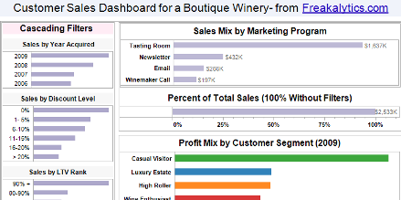
View and interact with the strategic customer sales and analyst exploratory dashboards below, both hosted by tableau public.

Read Eileen’s white paper, “Visual Management of Marketing Programs“, for detailed explanations on maximizing Marketing ROI with visual marketing dashboards.

In this case study, we used customer demographic and sales databases from a boutique winery in combination with Tableau Software

Read more

tableau public — share your visual insights with the world!

tableau public is now available! What’s not to love? Free web hosting of your visualization and a free desktop license of tableau public, based on the award-winning, rapid data visualization tools in Tableau Desktop and Tableau Server. With tableau public, you can learn the breadth of Tableau while sharing your insights with the world on any blog or web site.
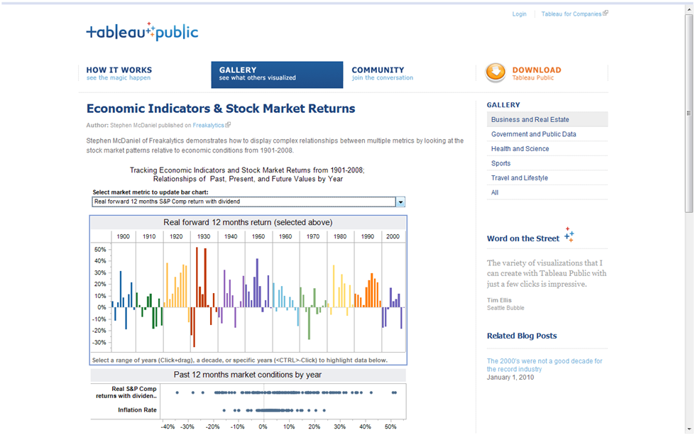
 
Freakalytics is excited to be featured on the home page of tableau public, highlighting our stock market returns dashboard!
 

Click here to read the details about this dashboard, from our blog post last June.

Embedding tableau public content is simple and quick. Your web site visitors will need NO software installation, since Tableau depends on native Ajax functionality used by sites like GMail. Although not officially supported in the current release, tableau public is viewable and functions interactively on the iPhone based on our simple tests!

On your Tableau journey, consider…

Read more
Presidential Election Results with SAS Maps and Tile Charts

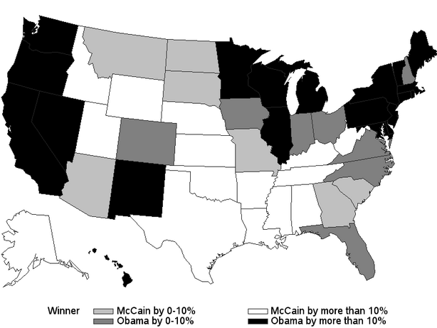
SAS 9.2 is a big leap forward in many areas. One of them is a variety of new graph types and easy access to creation in SAS Enterprise Guide 4.2. I think these two charts offer a fascinating look at the 2008 Presidential Election Results using SAS Maps and Tile Charts from the upcoming book, “SAS for Dummies”, updated for SAS 9.2 and available for purchase this Spring!

One of my favorite new examples added to the 9.2 edition of the book shows the 2008 presidential election results in two views: a map of the US with the winner by % margin of victory and a tile chart showing the state size, the winner and their % margin of victory. Due to the black and white nature of the book, these are shown in grayscale in the book and here on the blog.

2008 Presidential Election Results on a Map, Winner by State with Margin of Victory

Read more

Your favorite Freakalytics blog posts of 2009!

Number 6 Waterfall chart examples with detailed instructions on creating them with your own data in Tableau Waterfall Chart in Tableau and a Superior Alternative… Number 5 Do your New Year’s resolutions have you wondering where your money goes@f11 Here’s a snapshot of the average American and their spending habits How the average American spends … Read more

Tableau College Student Edition for Just $69-$99!

Learn the hottest visual analysis tool and impress your friends, your professors, your drinking buddies and even your family with incredible visual analytics from Tableau! From great data presentations to data exploration to dashboards that wow your class, get all the features of Tableau Professional edition for $69 for 6 months or $99 for 12 … Read more

Spotlighting Example in Tableau

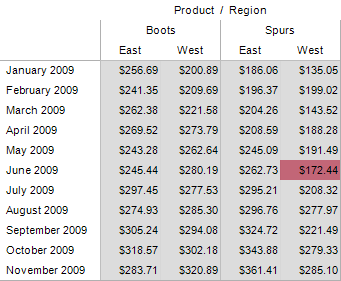
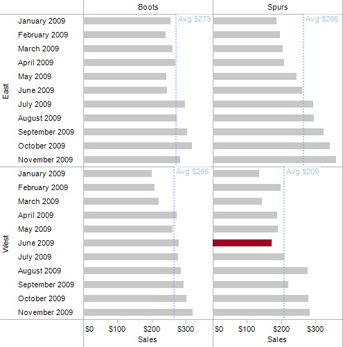
This workbook is an example of spotlighting in Tableau. Spotlighting involves applying user rules about data values to spot certain outcomes. With Tableau it is simple to apply basic to complex rules for spotlighting. This is beyond the standard highlighting capabilities available by placing measures on the color shelf.

As this example demonstrates, fairly complex rules can be used in Tableau to control spotlighting in simple calculated fields. Comments appear on the captions in each view (bottom of each view area in the Tableau workbook.)

Text Table Spotlighting
Spotlighting1

Bar Chart Spotlighting
Spotlighting2

This example was

Read more

Recommended Books for Analytics and Visual Analytics

Reviews of Stephen’s latest book, “Rapid Graphs with Tableau” “A great work — this is going to be a much loved book.” Marc Rueter- Director of Sales Consulting, Tableau Software “A must read for anyone interested in Tableau. Clear explanations, practical advice and beautiful examples…” Elissa Fink – Vice President of Marketing, Tableau Software Back … Read more