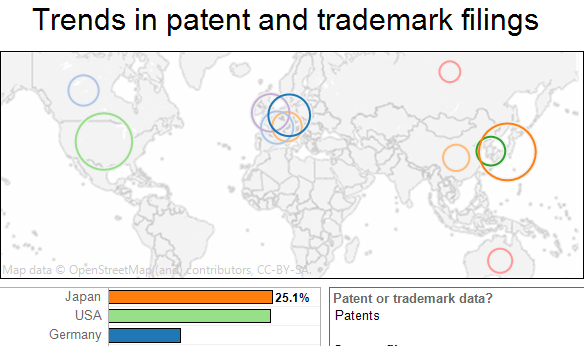
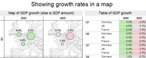
Tableau Tips: displaying growth rates in maps
A response to the TDWI article, “An Imperative to Build, Not Buy, Agile BI”
 As TDWI and vendors catch on to the success of “Agile BI” being created with products like Tableau, I find the need to reply to the idea that the same old technology will work in this new world. This article from TDWI energized me to write a response to this frequently cited idea. In case you aren’t familiar with the acronmym “BI”, it simply means business intelligence, typically referring to traditional tools like Cognos, Business Objects, Excel, Microstrategy, SAS and many other products.
What is Agile BI?
“Agile BI” is new-found jargon that describes what
Map dashboard, state budget shortfalls for 2011, just 30 minutes with Tableau
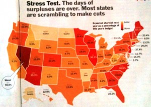 Time magazine recently published a map of state budget shortfalls for 2011 by state. While this was a good attempt, I thought it would be informative to show this data in Tableau to offer additional insight. The image of Time’s map is not as clear as a regular scanned image since I used my iPhone- taking the photo on a flight!
There are three primary areas for improvement
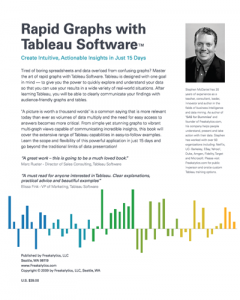
“Rapid Graphs with Tableau”, free preview and how to purchase it at Amazon
The version 5 book is now out of print.
Here is where you can find out about
Rapid Graphs with Tableau 7 or Rapid Graphs with Tableau 6
 |
 |
Click here for a complimentary preview of the Table of Contents and Chapter 1.
Reviews of “Rapid Graphs with Tableau”
“A great work — this is going to be a much loved book.”
Marc Rueter- Director of Sales Consulting, Tableau Software
“A must read for anyone interested in Tableau. Clear explanations, practical advice and beautiful examples…”
Elissa Fink – Vice President of Marketing, Tableau Software
Back Cover Text
Tired of boring spreadsheets and data overload from confusing graphs? Master the art of rapid graphs with Tableau Software. Tableau is designed with one goal in mind – to give you the power to quickly explore and understand your data so that you can use your results in a wide variety of real-world situations. After learning Tableau, you will be able to clearly communicate your findings with audience-friendly graphs and tables.
“A picture is worth a thousand words” is a common saying that is more relevant today than ever as volumes of data multiply and the need for easy access to answers becomes more critical. From simple yet stunning graphs to vibrant multi-graph views capable of communicating incredible insights, this book will cover the extensive range of Tableau capabilities in easy-to-follow examples. Learn the scope and flexibility of this powerful application in just 15 days and go beyond the traditional limits of data presentation!
The BI Challenge, “Feature lists miss the point” on DataDoodle
From datadoodle,
So many people who should know better seem to miss the point when they mention Tableau. Why? I asked BI veteran Stephen McDaniel for his thoughts – which he gave, but then went on to suggest an almost unheard of challenge: a data analysis face-off among vendors
SAT performance versus school spending dashboard
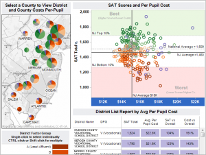 This dashboard provides a comparison of per student spending with performance on the SAT exam based on the 2009 New Jersey Report Card data. DFGs are based on economic and demographic data. These are assigned by the New Jersey State Department of Education.
This work was created in collaboration with Bob Morrison of Quadrant Arts Education Research. Bob has extensive experience with helping school systems measure educational results related to how and where funds are spent. I have a great admiration for Bob as a passionate advocate for growing both music and arts education. Bob has expertise in advocating on behalf of students around the many ways that music and arts education can engage students and improve their academic performance.
Thoughts about “Circle-Lust Continues”, just 30 minutes with Tableau
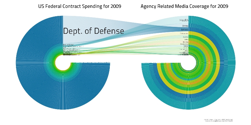
I read with fascination that this visualization won the Sunlight Foundation’s $5,000 prize for “Best Visualization Using Data about US Spending”.
This graphic is
Creating a data-driven culture in your company
A great summary of key requirements to build a data-driven culture, by Chris Stolte, Tableau co-founder: 1. Don’t fear the user, 2. Encourage corporate curiosity, 3. Manage to the outliers, 4. Measure, experiment and then measure again, and 5. Build trust and understanding. I would add two more points, one of which Chris is too … Read more
Dashboard tips by example- maps to inform, standard and novel approaches
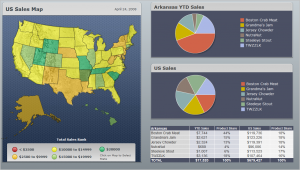
Dashboards developed for clients frequently incorporate maps. Tableau offers quick, simple yet insightful mapping capabilities out of the box. I have noticed that many maps used in my client’s dashboards attempt to display continuous measures. Examples include sales in the past quarter, year to date expenses versus budget or number of open sales opportunities. All … Read more
