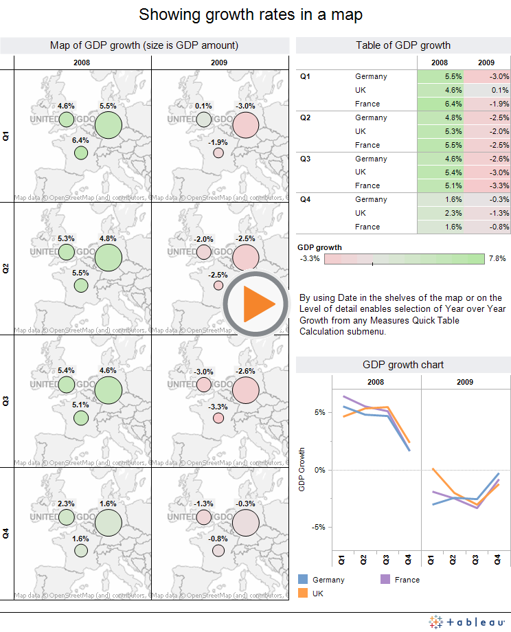
 A recent training attendee asked how to show year over year growth in a map. In particular, they wanted to use the Year over Year growth selection from the Quick Table Calculation menu. This simple dashboard with quarterly GDP data for three EU countries illustrates how this can be achieved. This works with date items aggregated at any level of date- annual, quarterly, monthly, weekly and lower levels.
Powered by Tableau
Select any country in the view to highlight it across all views in the dashboard. Click on the blank part of the view to deselect the highlighted country. Of course, you can download the full workbook from Tableau Public and study it in detail. Just click Download at the bottom right of the above example.
Share the power of R shiny apps across the entire team with YakData
The team at Freakalytics has built YakData brightRserver, our new cloud platform.
Securely share R shiny apps
Develop R shiny apps
All on one dedicated, secure and powerful platform.
Securely share R shiny apps
Develop R shiny apps
All on one dedicated, secure and powerful platform.
Subscribe and keep in touch with us!