Bullet charts and simple enhancements to maximize value

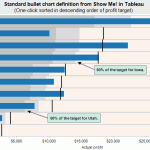
Bullet charts were added to Tableau in version 5.1. They are an original idea designed and advocated for by Stephen Few, at the University of California at Berkeley. The bullet chart is intended to enable easy examination of attainment relative to a target for categorical items.
 
According to Stephen’s original specification, “The bullet graph was developed to replace the meters and gauges that are often used on dashboards. Its linear and no-frills design provides a rich display of data in a small space, which is essential on a dashboard.

I have shown the standard Tableau bullet chart and a wide array of variants in our public training course. Based on extensive attendee feedback, I will share how just a few minutes spent enriching your bullet charts will yield powerful enhancements for your dashboard audience.
 

Read more

A response to the TDWI article, “An Imperative to Build, Not Buy, Agile BI”

As TDWI and vendors catch on to the success of “Agile BI” being created with products like Tableau, I find the need to reply to the idea that the same old technology will work in this new world.   This article from TDWI energized me to write a response to this frequently cited idea.   In case you aren’t familiar with the acronmym “BI”, it simply means business intelligence, typically referring to traditional tools like Cognos, Business Objects, Excel, Microstrategy, SAS and many other products.  

What is Agile BI?  
“Agile BI” is new-found jargon that describes what

Read more

Stephen Few’s latest book, “Now you see it”

Stephen’s latest book is a brilliant interplay of simple to advanced statistical concepts with powerful visual equivalents and methods. It offers wonderful guidance with great examples around visualizing time series, correlations and multivariate analysis problems. It will have a major impact for many years to come in changing how business analysts work, think and improve … Read more

S&P Composite Stock Market Returns Dashboard

Finance-SnP-stock-market-returns-100-yearsEconomic Indicators and S&P Composite Returns
from 1901-2008
A Dashboard to Explore Past, Present and Future Results

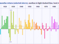
When creating a dashboard, two critical questions to ask include, “what are the right metrics” and “what collection of graphs will optimize exploration and understanding from a complex relationship between multiple metrics”? This example uses historic economic and stock market data to explore these concepts and to provide powerful insights into stock market patterns relative to economic conditions. This interactive dashboard is powered by tableau public, a new service of Tableau Software. One means of interacting with this dashboard is data point brushing, highlight data in a part of the dashboard by single-clicking and dragging

Read more

Visual Analytics Best Practices—avoid flash, keep it simple!

Why don’t you just show me the numbers?

  • Poor presentation of data can make informative interpretation difficult or even impossible.
  • We spend years diagramming sentences & solving equations but have minimal exposure to telling stories with data!
  • The ability to explore, understand and utilize real-world data is a rare skill that can dramatically improve your organization and career.

Sample revenue data from a university

College Quarter Total Revenue Tuition Research Plan Revenue
Arts 2009-01 $5,510,268 $5,230,198 $280,070 $6,000,000
Design 2009-01 $703,770 $408,762 $295,008 $680,000
Engineering 2009-01 $25,139,083 $6,201,932 $18,937,151 $26,800,000
Sciences 2009-01 $4,439,991 $2,159,010 $2,280,981 $4,400,000


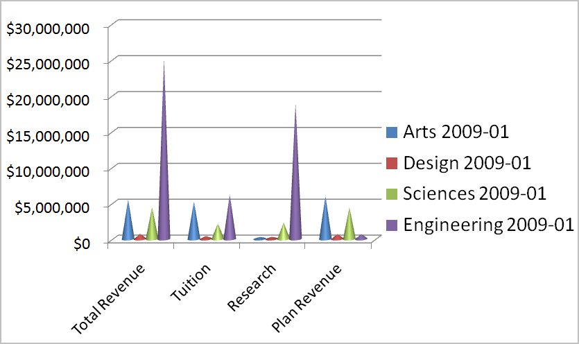
A prickly example

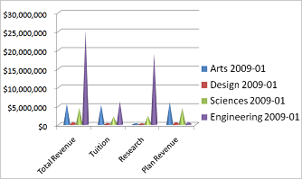
While it is indeed looking sharp, this graph is uninformative.

Read more