Freakalytics Newsletter for June 2013

Thank you for your interest in our newsletter. Please share it with your colleagues that can benefit from it.   Also, Stephen is once again full-time at Freakalytics and we are excited to be back on the road, so please let us know if we can be of service!


Freakalytics_Timeline_Since_2007_Map.pngFreakalytics Timeline

Since 2007, we have traveled 365,000 miles to help tens of thousands of people via

8 books,
24 conference talks,
47 public trainings,
26 on-site trainings,
5 conference seminars,
15 analytic advisory engagements
and 36 consulting projects.

Click here to download a summary of our accomplishments since 2007.


Read more

Free Webinar—Visual Analytics Best Practices
Why Can’t You See My Point?!?

201306-Freakalytics-Nuclear-Power-602

You can have brilliant ideas,
but if you can’t get them across,
your ideas won’t get you anywhere.

-Lee Iacocca


The webinar is past but you can watch the recording and view the slides below.
This post is currently being updated with the slides and videos.

Why do visual analytics best practices matter?

Why can’t people see your point when you present data-oriented presentations?

Whether you are using big data, small data or summarized data that has been prepared for you, this webinar will explore these vital questions. If you are concerned with getting the most from your data, this complimentary webinar is a great step in learning how to clearly communicate with people as they make better informed decisions in the hectic world of modern business.

Read more

Free Webinar—Better Dashboards in Tableau 8
Video and Slides Now Available

201306-Freakalytics-Nuclear-Power-602Attend this complimentary webinar for ideas and inspiration to design informative, dynamic and captivating dashboard experiences with Tableau 8.

The webinar is past but you can watch the recording, download the workbook and view the slides below.

In this complimentary webinar, Stephen will walk you through the steps to build one of the advanced dashboards that ships in Tableau 8. Stephen will be using the World Nuclear Power Plants example that he designed while Director of Analytics at Tableau. Stephen was inspired to create this example based on the work of Peter Aldhous at The New Scientist.

Click here for the rest of this post including webinar slides, video and example workbooks

Read more

Joyful or informative charts? Best practices in visual analytics

Small_packed_bubble_chartStephen Few, noted visual analytics expert and the original inspiration for our work in the field, recently wrote about criticisms of best data visualizations practices. In particular, Amanda Cox of the New York Times said, “There’s a strand of the data viz world that argues that everything could be a bar chart. That’s possibly true but also possibly a world without joy.” And Nathan Yau of Flowing Data wrote, “in visualization you eventually learn that there’s more to the process than efficient graphical perception and avoidance of all things round. Design matters, no doubt, but your understanding of the data matters much more.” These are both people who have a body of work that I admire but I am also surprised at these comments.

This discussion reminds me of a similar problem in marketing and web analytics. Generating traffic that leads to sales is good. Eventually, someone finds a way to generate traffic that leads to not many new sales, but management is misled to think this must be good since traffic leads to sales. This is similar to “look, this chart is beautiful“, but hard to interpret or understand. So, while we delivered fun graphs, minimal information is shared. This may be good for traffic, but not so much for higher sales.

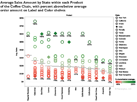
I suspect that part of this recent criticism can be traced back to Stephen’s recent criticism of Tableau, “Tableau Veers from the Path“. In it, he mentions a new graph type in Tableau, packed bubble charts and contrasts them with bar charts. This is an example of the “avoidance of all things circular”. Is Stephen truly anti-joy@f16 Will an example show him to be wrong@f17 Let’s give it a try and you can judge for yourself.

Here’s a packed bubble chart example

Read more

Show growth over time but hide the baseline in Tableau

A client asked,

What I want to show is a YoY (year over year) or WoW (week over week) comparison – however the first data point is always missing – even when the underlying data are available.

For example:
The full set of data shows a null value for 2006 – just because there is no data available to compute a comparison.
Now I want to move the date filter to start @ 2007 – and now 2007 has a null value even though we have data available to compute that metric.
” What’s the issue and how can I display only years

Read more

Data Driven Conference 2012

We are having a great time at the Data Driven Conference in Columbus! Our first session was standing room only and we are presenting the same talk a second time at 1:30 in E161.

Interesting questions include “how do you become better at asking the right questions that lead to better analysis” and “how do you communicate with IT to get better data”?

To buy a copy of The Accidental Analyst, please visit www.AccidentalAnalyst.com.

Here is our infographic that we created

Read more

Patriotic colors and maps in Tableau (US colors)

 
While preparing for a conference, we decided to create a map to show the US states using patriotic (US flag) colors.   The colors of the US flag are precise, so we needed to modify the Tableau preferences file to use the correct colors (also, white is not part of the Tableau color palette for discrete data items.)

After modifying our Preferences.TPS file with a new US Flag color palette and saving it to My Tableau Repository (a directory, typically in My Documents), we were able to create the red, white and blue map of the US!   To download the Maps, a sample workbook and the changed Preferences.TPS file, just log in below.

Read more

Book Excerpt: Tableau 7 Quick Table Calculations and Custom Table Calculations

This is a free preview from Rapid Graphs with Tableau Software 7, available in print and Kindle on Amazon and on the Nook at Barnes and Noble. Due to width constraints on this blog, you may notice some loss in resolution compared with the purchased book, which has approximately 2.5 times better resolution.


Read more