The following article features Tableau 6 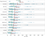
Reference lines, bands or distributions may be added to your views to emphasize particular values or areas that may be useful in interpreting your data. In particular, when comparing multiple groups or categories of data, reference lines and bands provide immediate feedback on the overall differences between the groups.
Reference lines
Reference lines are vertical or horizontal lines displayed on your view that mark requested values such as average, median, minimum, maximum, sum, total and constants (such as a line that separates the data points as being above or below a target). They can be added on any continuous axis.
1) Open the Sample – Coffee Chain (Access) data source included by default with Tableau 6
2) Place Sales on the Columns shelf and change the aggregate to Average.
3) Place Product on the Rows shelf,
State and Date on the Level of Detail shelf
and format Date to ‘MMMM YYYY’.
Read more
 We are always excited to see new people using visual analytics with data in the public interest. After seeing some great poverty analysis work from the Utah Department of Workforce Services, we wanted to share some ideas that might provide inspiration to them.