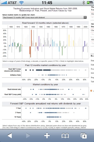
It is frustrating to see valuable information hidden in well-meaning, but uninformative charts. FlowingData.com referenced just such an article, “How The Average U.S. Consumer Spends Their Paycheck“.
The chart in the original article at Visual Economics is indeed attractive. Unfortunately, it is also very hard to understand. Key data relationships that should jump off of the chart are obscured by the donut chart and excessive chart text or “chart junk”.
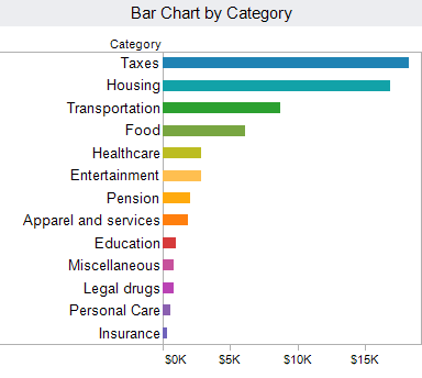
Here are several accessible and simple ways to present this fascinating data. All of these examples were created with Tableau.

