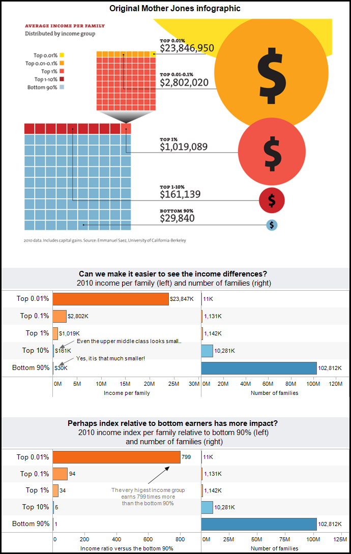
A colleague shared this Mother Jones infographic, which attempts to explain the disparity in income between richer and poorer families in the US. The data is indeed fascinating, but quite difficult to read in their flashy infographic.
There are two major issues that hinder understanding when viewing this infographic:
1) Using areas of circles to encode the incomes is very difficult for most people to interpret. Additionally, with the difference in income being so large, it is nearly impossible to fit this on a normally sized web page. The largest group, the yellow circle, is mostly cut off in their infographic.
2) The infographic is overloaded with two 10 by 10 cubes in order to explain the idea of percentiles (e.g.- top 1%) and a subset of the top percentile. In our simplification, we explain these percentiles in terms that an average person can hopefully understand (e.g.- top 1 in 100.)
One last point of interest, the groups are all independent of each other except for the top 1% group. This group includes the highest two income groups and the balance of top 1% families not in the top 2 groups. This is why the infographic has 2 “cubes” that subdivide into 100 cells each. In our opinion, this makes the infographic nearly unreadable by the casual viewer.

Click here to see the original Mother Jones article.
Securely share R shiny apps
Develop R shiny apps
All on one dedicated, secure and powerful platform.
