
Joe Mako recently created a Tableau version of a Marimekko char inspired by an example from Jon Peltier, an Excel charting expert.
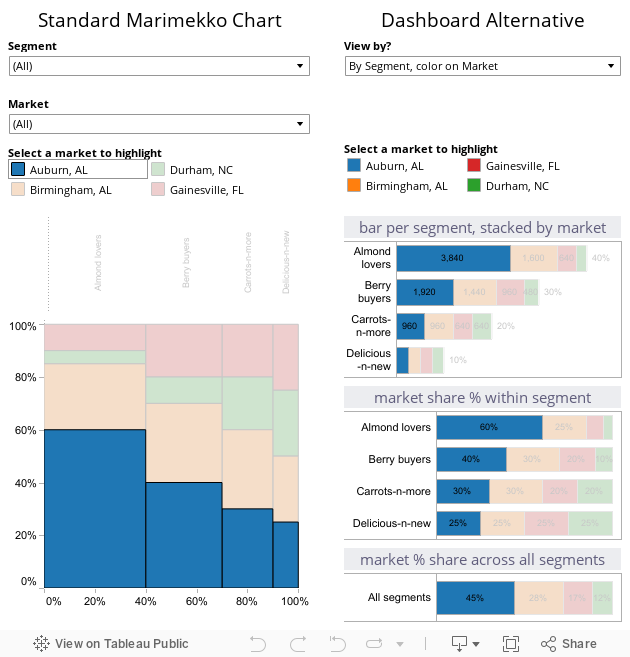
When I first saw this chart, I was curious as to the utility of this chart type for regular business decision-makers. I agree that for advanced analysts, it can offer a compact, contained means to present information across two categorical items (dimensions in Tableau) and metric (a measure in Tableau.) You can see this in the Marimekko chart created by Joe Mako in the left half of the dashboard below. When you examine the Marimekko chart you can see the dominant cities and the relative share of each segment within each city. You can also select the city names above the view to highlight a specific city. For example, you can easily discern that Almond Lovers are the biggest group of customers for this company and Delicious-n-new are the smallest group.
However, it is somewhat challenging to ascertain within Gainesville, FL which segment is the largest and smallest for this city. If you hover over each Gainesville, FL value in the original chart, you will see that two segments are identical in size; this is very hard to see without the hover values. This is due to the varying width and length dimensions for each tile in the chart.
After considering this interesting example, I created an interactive, alternative approach using simpler stacked bar charts. Each bar chart section explains a different aspect of the data. The top chart shows the nominal amounts within each city stacked by segment, the second chart shows the % of total contribution of each segment by city and the last one shows the overall contribution of each segment for all cities combined.
By displaying actual sale amounts and percent contribution in the first two bar charts you can easily see that Berry Buyers are the biggest segment in Gainesville, while Carrot-n-more is tied for second place with Almond lovers. Additionally, I simplified the hover values for the chart from the original Marimekko; this makes it easy to see the sales amount and the percentage contribution of a segment within a city.
To further enhance viewing flexibility, I utilized parameters in Tableau with several calculated fields to add chart control interactivity. By using the dropdown selector at the top of the right side, you can reverse the structure of the stacked bar charts to show the data in rows by product and colored by city. By switching the colored segments dimension with the row header dimension, you can quickly see a different perspective on the data using the original color palette or the segment-based color palette.
Static image of Marimekko chart and alternative version dashboard; see below image for interactive version

Interactive version of Marimekko chart and alternative version dashboard
Freakalytics is the exclusive source of the original
Complete Tableau Training (4 days) and our new course,
Data Management and Visual Analytics with Tableau (2-days).
For a detailed review of Tableau features, pricing and capabilities, visit PowerTrip Analytics.
For the Tableau Online pricing calculator, click here.
Securely share R shiny apps
Develop R shiny apps
All on one dedicated, secure and powerful platform.