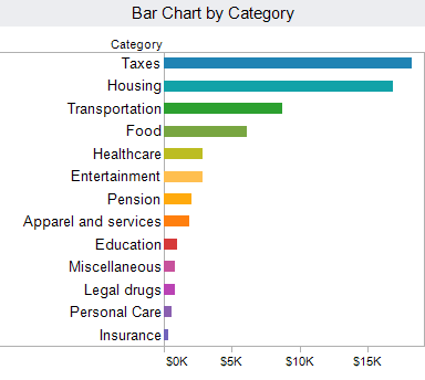
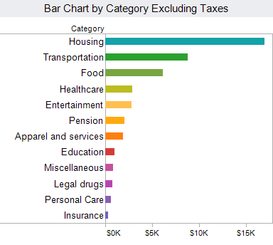
It is frustrating to see valuable information hidden in well-meaning, but uninformative charts. FlowingData.com referenced just such an article, “How The Average U.S. Consumer Spends Their Paycheck“.
The chart in the original article at Visual Economics is indeed attractive. Unfortunately, it is also very hard to understand. Key data relationships that should jump off of the chart are obscured by the donut chart and excessive chart text or “chart junk”.
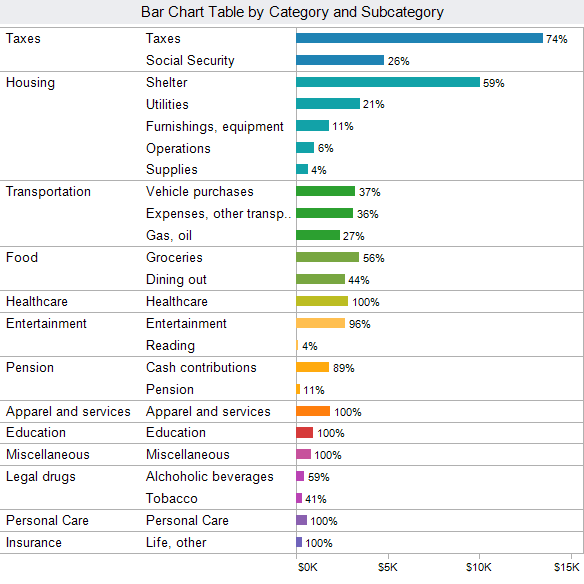
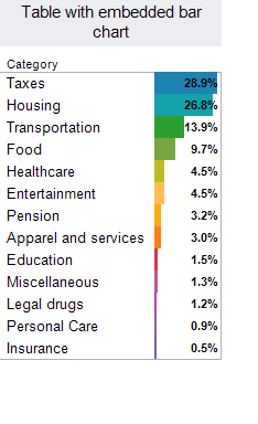
Here are several accessible and simple ways to present this fascinating data. All of these examples were created with Tableau.


 A few notes on the original data.
- I have reorganized it somewhat from the original version for clarity.
- Taxes should be considered one of the ways your income is spent! The pension data included one of these taxes, Social Security. The government is under no official obligation to pay out on Social Security, so it is a tax rather than a true pension. Of course , any Congress that significantly cut Social Security would likely be voted out, so it is almost a sure thing but not guaranteed!
- One other oddity. In the US, we are spending around 15% of GDP on medical care. This data shows 4.5%, I am unsure why there is such a large discrepancy. I have not attempted to correct this here.
- Finally, back to Social Security. Your employer pays an equivalent amount as the “employer share”. If this was included, taxes would be ~34% of income. This would place taxes significantly ahead of housing as our largest expenditure.
Share the power of R shiny apps across the entire team with YakData
The team at Freakalytics has built YakData brightRserver, our new cloud platform.
Securely share R shiny apps
Develop R shiny apps
All on one dedicated, secure and powerful platform.
Securely share R shiny apps
Develop R shiny apps
All on one dedicated, secure and powerful platform.
Subscribe and keep in touch with us!