Waterfall Chart in Tableau and a Superior Alternative…

The 1st workbook walks you through building a standard Waterfall chart in Tableau. Waterfall charts are intended to show you how cash balances change over time based on transactions that either add to or subtract from the cash account of a business. As this example demonstrates, many non-standard chart types can be created in Tableau … Read more
Marimekko charts and an interactive alternative for a broad audience

Joe Mako recently created a Tableau version of a Marimekko char inspired by an example from Jon Peltier, an Excel charting expert. When I first saw this chart, I was curious as to the utility of this chart type for regular business decision-makers.   I agree that for advanced analysts, it can offer a compact, … Read more

How long should my presentation be?

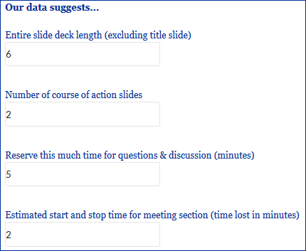
Always leave them wanting more! –P.T. Barnum Creator of “The Greatest Show On Earth!®“ About our Presentation Length Calculator Creating compelling presentations that are clear and actionable are the lifeblood of successful analyst teams. Often, analysts have worked on problems for days or weeks and have much more material to present than is relevant or … Read more

Shark Tank investments – using data to understand the Sharks

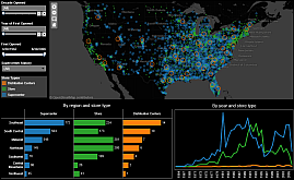
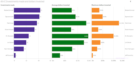
Using data from the first four seasons of the Shark Tank, Freakalytics has assembled a few fascinating insights for fans and potential entrepreneurs that may come before the Sharks in future seasons. While Barbara Corcoran is the most frequent investor. Mark Cuban is the investor with the largest amount invested and Mr. Wonderful invests the … Read more

Communicate Your Results, a Case Study from
the 7th C of The Accidental Analyst

You can have brilliant ideas, but if you can’t get them across, your ideas won’t get you anywhere. –LEE IACOCCA Engineer on the original Ford Mustang design team and CEO during Chrysler’s comeback in the 1980’s.   From the Seven C’s of Data Analysis Framework     Maria is a Senior Sales Analyst for an … Read more

Open source editor for D3 data visualization

At Freakalytics, we’ve used the D3 data visualization library on several client projects and have been impressed with the nearly infinite set of graphing, charting and mapping possibilities.  Unfortunately, we were less impressed with the high learning curve, level of effort and complexity involved in developing and customizing the desired visualizations. Perhaps you have seen … Read more

RStudio Keyboard Quick Reference by Freakalytics

At Freakalytics, we frequently use R (often referred to as RStats) in our client projects and wanted to share our success using the RStudio Interactive Development Environment (IDE) with you. So, we created the RStudio® Keyboard Quick Reference by Freakalytics. It is available to you, compliments of Freakalytics, as a PDF and later in this … Read more

From Business Intelligence to Visual Analytics
Craft a Winning Data Strategy

Stephen McDaniel and Eileen McDaniel, Ph.D. Freakalytics, LLC Topics: Data Analysis, Visual Analytics and Business Intelligence This was originally published in the TDWI FlashPoint Newsletter in August of 2014 Italicized sections, images and their captions were not part of the TDWI version. Until recently, visual analytics was considered a niche area. Those days are quickly … Read more

Three great data visualization stories from Qlik World 2014

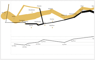
At the Qlik World 2014 expert data visualization panel, moderated by Donald Farmer, Donald asked each panelist to offer up one of our favorite data visualizations for inspiration and learning. Alberto Cairo, Visualization at The University of Miami, offered up John Snow’s 1854 map of London that helped demonstrate that cholera was spread by contaminated … Read more