 This is a free preview from Rapid Graphs with Tableau Software 7, available in print and Kindle on Amazon and on the Nook at Barnes and Noble. Due to width constraints on this blog, you may notice some loss in resolution compared with the purchased book, which has approximately 2.5 times better resolution.
Uncategorized
2012 NCAA football rankings–ranked teams per conference
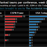 Teams inlcuded in this week:
USC, LSU, Alabama, Oklahoma, Oregon, Georgia, Florida State, Michigan, South Carolina, Arkansas, West Virginia, Michigan State, Wisconsin, Clemson, Texas, Ohio State, Stanford, Nebraska, TCU, Virginia Tech, Oklahoma State, Kansas State, Florida, Boise State, Notre Dame, Louisville, Washington, Auburn, Georgia Tech, North Carolina, Utah, NC State, Baylor, South Florida, Texas A&M, Cincinnati, Brigham Young, Tennessee, Mississippi State, Virginia, Louisiana Tech, UCF, Houston, Rutgers, Southern Miss, Missouri, Florida Intl, Northern Illinois, Texas Tech
Conferences included in this week:
SEC, Big 12, ACC, Big Ten, Pac-12, Big East, USA, Ind, Mid-Amer, Mntn Wst, Sun, WAC
2012 NCAA football rankings–ranked teams by location
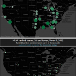 Teams inlcuded in this week:
USC, LSU, Alabama, Oklahoma, Oregon, Georgia, Florida State, Michigan, South Carolina, Arkansas, West Virginia, Michigan State, Wisconsin, Clemson, Texas, Ohio State, Stanford, Nebraska, TCU, Virginia Tech, Oklahoma State, Kansas State, Florida, Boise State, Notre Dame, Louisville, Washington, Auburn, Georgia Tech, North Carolina, Utah, NC State, Baylor, South Florida, Texas A&M, Cincinnati, Brigham Young, Tennessee, Mississippi State, Virginia, Louisiana Tech, UCF, Houston, Rutgers, Southern Miss, Missouri, Florida Intl, Northern Illinois, Texas Tech
Conferences included in this week:
SEC, Big 12, ACC, Big Ten, Pac-12, Big East, USA, Ind, Mid-Amer, Mntn Wst, Sun, WAC
2012 NCAA football rankings–scaled points across three polls
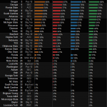 Teams inlcuded in this week:
USC, LSU, Alabama, Oklahoma, Oregon, Georgia, Florida State, Michigan, South Carolina, Arkansas, West Virginia, Michigan State, Wisconsin, Clemson, Texas, Ohio State, Stanford, Nebraska, TCU, Virginia Tech, Oklahoma State, Kansas State, Florida, Boise State, Notre Dame, Louisville, Washington, Auburn, Georgia Tech, North Carolina, Utah, NC State, Baylor, South Florida, Texas A&M, Cincinnati, Brigham Young, Tennessee, Mississippi State, Virginia, Louisiana Tech, UCF, Houston, Rutgers, Southern Miss, Missouri, Florida Intl, Northern Illinois, Texas Tech
Conferences included in this week:
SEC, Big 12, ACC, Big Ten, Pac-12, Big East, USA, Ind, Mid-Amer, Mntn Wst, Sun, WAC
2012 NCAA football rankings–conferences and teams
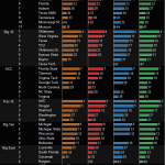 Teams inlcuded in this week:
USC, LSU, Alabama, Oklahoma, Oregon, Georgia, Florida State, Michigan, South Carolina, Arkansas, West Virginia, Michigan State, Wisconsin, Clemson, Texas, Ohio State, Stanford, Nebraska, TCU, Virginia Tech, Oklahoma State, Kansas State, Florida, Boise State, Notre Dame, Louisville, Washington, Auburn, Georgia Tech, North Carolina, Utah, NC State, Baylor, South Florida, Texas A&M, Cincinnati, Brigham Young, Tennessee, Mississippi State, Virginia, Louisiana Tech, UCF, Houston, Rutgers, Southern Miss, Missouri, Florida Intl, Northern Illinois, Texas Tech
Conferences included in this week:
SEC, Big 12, ACC, Big Ten, Pac-12, Big East, USA, Ind, Mid-Amer, Mntn Wst, Sun, WAC
Important presentation? Have paper notes of your key points at the podium!
 Here’s a copy of my key points from Part 3 of our recent Big Data analytics webcast, “Big Data” on your laptop, fast, informative and at your command.
If you are making an important presentation about an analysis and you haven’t written down your key points on paper, why aren’t you doing this@f1@f2@f3 Make your presentation much less stressful and ensure
Free Webcast: “Big Data” in US History, Exploring the 1790 US Census
NOTE: This fun review of “big data” was inspired by a recent presentation I gave on behalf of Tableau Software at the Big Data Conference in Chicago. You can find the 1st part of this 3 part webcast here, “Performance to Cost Index & my personal history with “Big Data”. Part 3 is here, “Big Data” on your laptop, fast, informative and at your command.
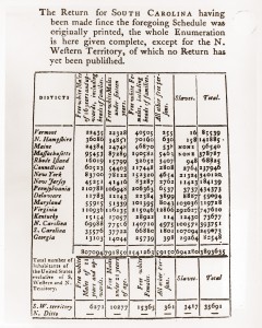
In this presentation, I share a review of the original big data in US history, the 1790 US Census. Some surprises are found along the way, including data quality issues in the Census reports and a surprising
Free Webcast: Performance to Cost Index & my personal history with “Big Data”
NOTE: This fun review of “big data” was inspired by a recent presentation I gave on behalf of Tableau Software at the Big Data Conference in Chicago. You can find the 2nd part of this 3 part webcast here, ““Big Data” in US History, Exploring the 1790 US Census”. Part 3 is here, “Big Data” on your laptop, fast, informative and at your command.
Many people ask me, what is “big data”? For most of them, the right answer is that big data is any data that is difficult to use or understand (yes, I know the official, “correct” answers, which often vary and typically include topics like Hadoop and Cloudera.)
In this presentation, I share my experience with the Commodore 64, the PS/2, DEC Stations, VAX servers, Solaris Servers, PC’s and a MacBook Pro. Products and languages covered include BASIC, FORTRAN, SAS, Oracle, Teradata and Tableau.
It is truly astonishing
History of US House representation from 1910 through 2010
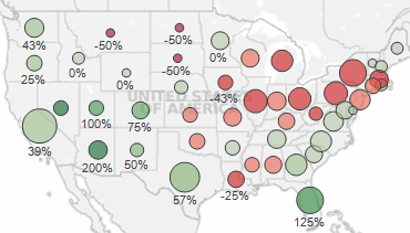 A few observations from this example
Examining this dashboard with the initial decades of 1960 and 2010, you can see that the control of the House has shifted toward the West and the South. Exceptions include Louisiana, Mississippi and Oklahoma in the South and Montana in the West.
If you adjust the first decade slider to 1910, an even more dramatic pattern appears! People love the sunshine and the West coast with California, Florida and Nevada growth at 300%+ and Washington, Oregon, Utah and Colorado at 67% or more growth.
Dashboard topics in this example
Download the workbook to peek at a few cool features of this dashboard, including:
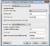
1) Using table calculations
Bringing clarity out of an infographic, “Income Inequality in the US” from Mother Jones
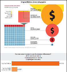
A colleague shared this Mother Jones infographic, which attempts to explain the disparity in income between richer and poorer families in the US. The data is indeed fascinating, but quite difficult to read in their flashy infographic.
There are two major issues that hinder understanding when viewing this infographic:
1) Using areas of circles to encode the incomes is very difficult for most people to interpret. Additionally, with the difference in income being so large, it is nearly impossible to fit this on a normally sized web page. The largest group, the yellow circle, is mostly cut off in their infographic.
2) The infographic is overloaded
