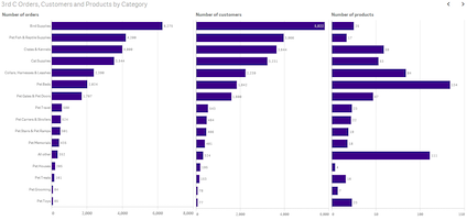
Shark Tank investments – using data to understand the Sharks

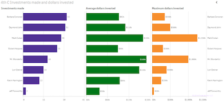
Using data from the first four seasons of the Shark Tank, Freakalytics has assembled a few fascinating insights for fans and potential entrepreneurs that may come before the Sharks in future seasons. While Barbara Corcoran is the most frequent investor. Mark Cuban is the investor with the largest amount invested and Mr. Wonderful invests the … Read more

Three great data visualization stories from Qlik World 2014

At the Qlik World 2014 expert data visualization panel, moderated by Donald Farmer, Donald asked each panelist to offer up one of our favorite data visualizations for inspiration and learning. Alberto Cairo, Visualization at The University of Miami, offered up John Snow’s 1854 map of London that helped demonstrate that cholera was spread by contaminated … Read more

Favorite charts for business analytics

I was asked by Donald Farmer of Qlik about my favorite charts.  Donald is leading a keynote panel on data visualization at Qlik’s World Conference with myself, Alberto Cairo and Kaiser Fung. While I can’t say that I have a favorite chart, I can definitely state that I often rely heavily on three chart types for much of … Read more