I was asked by Donald Farmer of Qlik about my favorite charts. Donald is leading a keynote panel on data visualization at Qlik’s World Conference with myself, Alberto Cairo and Kaiser Fung.
While I can’t say that I have a favorite chart, I can definitely state that I often rely heavily on three chart types for much of my work with clients.
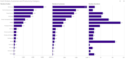
#1 A bar chart is likely the most versatile chart type. Capable of representing data by category, data over time and, my favorite, as aligned bars (sometimes called trellised or latticed).

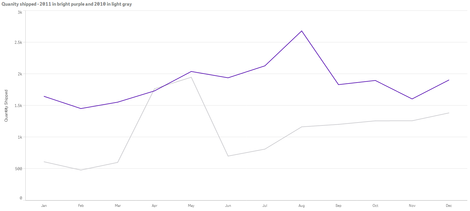
#2 Data over time is big in business, especially seeing how we are performing this year versus last. Here’s a great way to easily see this year (bright purple) versus last year (light gray) in a line chart. We are doing much better this year, with only April and May showing low or no growth.

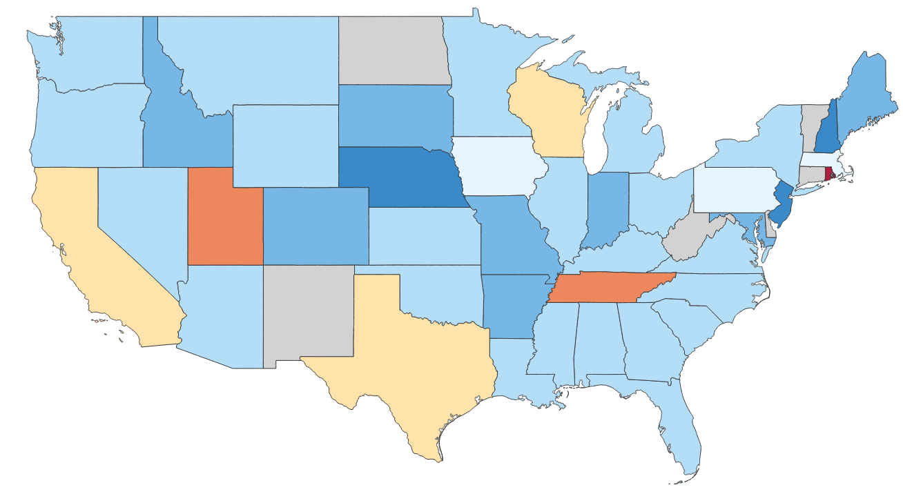
#3 Maps are critical to understanding business performance by location. I often scale the data against a benchmark or target and use a diverging color palette to find best performers and places that may need some help or guidance by management.

Securely share R shiny apps
Develop R shiny apps
All on one dedicated, secure and powerful platform.
