You can have brilliant ideas,
but if you can’t get them across,
your ideas won’t get you anywhere.
-Lee Iacocca
The webinar is past but you can watch the recording and view the slides below.
This post is currently being updated with the slides and videos.
Why do visual analytics best practices matter?
Why can’t people see your point when you present data-oriented presentations?
Whether you are using big data, small data or summarized data that has been prepared for you, this webinar will explore these vital questions. If you are concerned with getting the most from your data, this complimentary webinar is a great step in learning how to clearly communicate with people as they make better informed decisions in the hectic world of modern business.
Synopsis
Are you clearly communicating the message that you want to deliver from your data? If you’re tired of your tables and charts being “good enough”, learn some tips and tricks to help make them great! We’ll demonstrate how choosing the right table, chart and metrics to answer the question at hand and how to simplify your visuals for maximum impact. Regardless of whether you use Excel, SAS, R, PowerPoint, Qlikview, Tableau, Business Objects, Cognos, Microstrategy or most any other analytics tool for your analysis, you will benefit from this thought-provoking presentation.
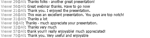
For everyone who joined, thanks for your support and participation during the Q&A!
Chat comments at the end of the webinar
Click here for the video and presentation
The webinar video
Internet Explorer requires compatibility mode to view the videos at Freakalytics. On newer versions of Internet Explorer, click the IE gear icon in the upper-right for menus, select Compatability View settings. A dialog appears where you should add freakalytics.com to your Websites you’ve added to Compatability View list.
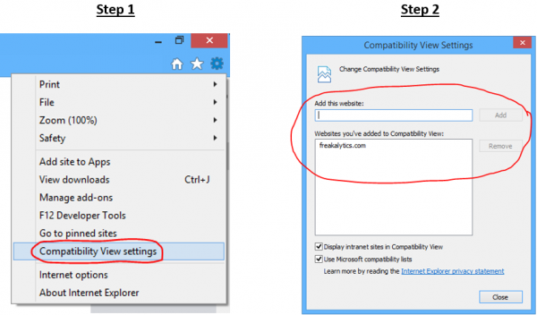
On older versions of IE, click the broken page icon at the far right of the address bar
![]()
Video Index
01:58 Why can’t you see my point!
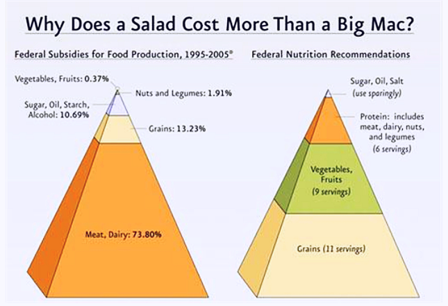
03:00 1st example, “Why does a salad cost more than a Big Mac?”
05:25 Improvements
08:48 2nd example, from a simple table to poor software suggestions to insight.
10:55 Improvements
13:21 3rd example, examining growth, even more useless software defaults
14:27 Improvements
16:26 4th example, avoid chart junk!
18:03 Answer questions with a thoughtful chart
20:19 5th example, health spending vs. life expectancy for G7 countries,
creating a crowd-pleasing but useful chart.
24:27 6th example, information overload-health spending versus life expectancy.
25:18 Bringing clarity to the question with a scatter plot
26:11 Thoughtful data grouping to demonstrate diminishing returns in world health spending.
28:09 Visual analytics best practices, a reduction for beginners
29:11 When exact values matter: text tables, highlight tables and heat maps
32:32 Compare data across categories with bar charts and pie charts
35:34 Compare data across and within categories: stacked bar charts,
side-by-side bar charts, circle plots and area graphs
41:22 Changes over time with three types of line graphs (also refer back to area graphs)
46:08 Did we achieve our goals? Bullet graphs
48:47 Does location matter? Symbol maps and filled maps
51:40 Closing points to remember when sharing data with tables, charts, graphs and maps.
The presentation from this webinar
Use the controls to navigate. On touch-screens, you can swipe to navigate. Click on the slide to advance, click the four squares in the controls for the thumbnails to appear and click the four-way arrows for full-screen viewing. While in full-screen viewing mode, you can use the right/left arrow keys to advance/go back or simply swipe right and left on touch-screens. Use the ESC key or x in bottom control-bar to exit full-screen mode.
[portfolio_slideshow include=”9430,9431,9432,9433,9434,9435,9436,9437,9438,9439,9440,9441,9442,9443,9444,9445,9446,9447,9448,9449,9450,9451,9452,9453,9454,9455,9456,9457,9458,9459,9460,9461,9462,9463,9464,9465,9466,9467,9468,9469,9470,9471,9472,9473,9474,9475,9476,9477,9478,9479,9480,9481,9482,9483,9484,9485,9486,9487,9488,9489,9490,9491,9492,9493,9494,9495,9496,9497,9498″]
Enjoyed this? Please subscribe to our newsletter and share it!
We are a two-person, independent analytics company. Creating great content takes an enormous amount of time! You can support us by sharing this webinar on Twitter, Google + or Facebook—enabling us to continue creating new, unbiased educational content. You can subscribe below and then click one of the buttons above for a well-crafted Tweet, Facebook or G+ link. Thanks.
Subscribe to our newsletter