 Attend this complimentary webinar for ideas and inspiration to design informative, dynamic and captivating dashboard experiences with Tableau 8.
The webinar is past but you can watch the recording, download the workbook and view the slides below.
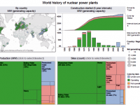
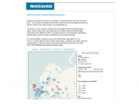
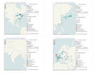
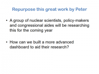
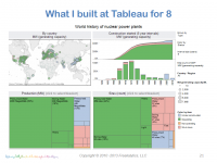
In this complimentary webinar, Stephen will walk you through the steps to build one of the advanced dashboards that ships in Tableau 8. Stephen will be using the World Nuclear Power Plants example that he designed while Director of Analytics at Tableau. Stephen was inspired to create this example based on the work of Peter Aldhous at The New Scientist.
Click here for the rest of this post including webinar slides, video and example workbooks
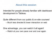
This webinar is an advanced review of features useful to people already familiar with the basics of dashboard development in Tableau. If you are new to dashboard development in Tableau, you can attend for ideas of what is possible with dashboards in Tableau 8. A sample workbook link will be provided for attendees to follow along and experiment with some of the features demonstrated during this webinar.
The webinar video
Internet Explorer requires compatibility mode to view the videos at Freakalytics. On newer versions of Internet Explorer, click the IE gear icon in the upper-right for menus, select Compatability View settings. A dialog appears where you should add freakalytics.com to your Websites you’ve added to Compatability View list.
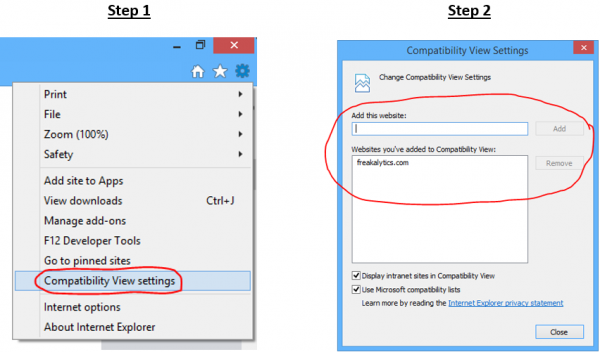
On older versions of IE, click the broken page icon at the far right of the address bar
![]()
The webinar workbooks
Download the attendee workbooks here (a .zip file,
download it and extract the two packaged workbooks)
Video Index
02:42 Starting point-Peter’s dashboard
04:04 Repurposing Peter’s work
08:14 Our plan for this dashboard
10:00 What I built, included in Tableau 8 samples
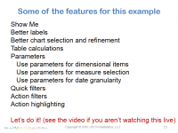
11:02 Features in this webinar & 1st view – % of whole
23:08 On to the 2nd view – time series
27:02 Add a parameter to 2nd view
43:49 3rd view – map
46:18 Start building dashboard
49:23 Uh-oh, actions I forgot about!
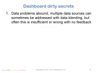
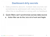
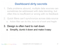
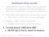
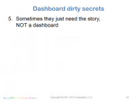
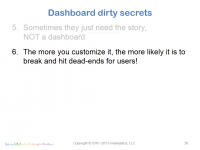
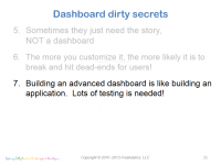
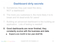
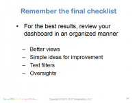
52:40 Dirty secrets of dashboard development
55:41 Sometimes a dashboard is too much!
58:53 Attendee question and answers
The presentation from this webinar
Use the controls to navigate. On touch-screens, you can swipe to navigate. Click on the slide to advance, click the four squares in the controls for the thumbnails to appear and click the four-way arrows for full-screen viewing. While in full-screen viewing mode, you can use the right/left arrow keys to advance/go back or simply swipe right and left on touch-screens. Use the ESC key or x in bottom control-bar to exit full-screen mode.


Enjoyed this? Please subscribe to our newsletter and share it!
We are a two-person, independent analytics company. Creating great content takes an enormous amount of time! You can support us by sharing this webinar on Twitter, Google + or Facebook—enabling us to continue creating new, unbiased educational content. You can subscribe below and then click one of the buttons above for a well-crafted Tweet, FB or G+ link. Thanks.
Subscribe to our newsletter