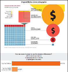
A colleague shared this Mother Jones infographic, which attempts to explain the disparity in income between richer and poorer families in the US. The data is indeed fascinating, but quite difficult to read in their flashy infographic.
There are two major issues that hinder understanding when viewing this infographic:
1) Using areas of circles to encode the incomes is very difficult for most people to interpret. Additionally, with the difference in income being so large, it is nearly impossible to fit this on a normally sized web page. The largest group, the yellow circle, is mostly cut off in their infographic.
2) The infographic is overloaded


