The following article features Tableau 6
Whether you are exploring your data for new insights, answering specific questions or even deciding what questions to ask, Tableau gives you unprecedented control to investigate, communicate and take action with the valuable information hidden in your data! Tableau has it all – a wide variety of options to graph your data, the ability to adjust your data so that you are using the right data in the right form for the questions at hand, and a user-friendly interface that’s designed around how people think about analysis, allowing you to follow your thoughts as you question and explore your data. You can work with every major data source, from Excel workbooks to the largest databases. You can even extract data from larger sources into a local “extract” file that will make your data exploration more efficient and allow offline analysis when you are away from the office.
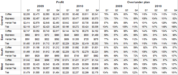
Profit and planned profit by product
Red is below plan, green is above
Percentage is actual versus plan
Black line in 2010 shows prior year profit amount

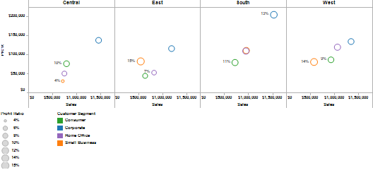
Displaying profit versus sales by region and customer segment Average profit ratio = size of bubble;
Minimum and maximum percents labeled per region
Colors are customer segments

Exploring the relationship of sales to profit by region,
Each point in the graph is a customer order
Colors show the Customer Segment
A Trend line is displayed for each customer segment per region

Map of per-capita income growth, 2006 to 2008
Color and size of bubble show growth rate
Labeled states show highest and lowest growth values for country

Scatter plot of per-capita income growth by region, 2006 to 2008
Median value for each region shown as reference line
Top and bottom states in each region are labeled

Faster than you thought possible, you can build presentation quality graphs and tables in Tableau. You can have total control over creating the view or you can ask Tableau to generate the view based on the data that you select. From the view, you can rapidly sort, filter and group the displayed data- with just a few clicks of your mouse. Each example demonstrates rapid changes made with Tableau in just a few seconds!
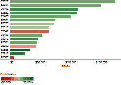
Sales and profit ratio by zip code- from bar chart to map with one click!


Highlight a data point to quickly examine the values behind it


Four views are better than one:
From detailed table to color-highlighted table to side-by-side bar chart to color-encoded bar chart in a minute!


You can easily change any part of your view to look exactly how you want, ranging from data, point shapes and colors to clear data labels to the way your metrics are calculated and compared. The days of thinking of your graphs as “good enough” are a relic of the past with Tableau!
Grouping the data with just a few clicks, from the view!


Color code view elements for effective communication


Getting started in Tableau is easy. In the first few weeks, you can learn the basics and begin mastering the techniques of graphical data exploration. Soon you’ll discover how to easily create more complex visualizations. You can now investigate those questions that you always wanted to, but thought were impossible!
Areas of simplicity
· Direct interaction with graph- drag and drop what you want to see
· Sort the data automatically or manually directly from the view
· Simple and complex grouping of data items categories from the view
· Easily exclude irrelevant data or keep only the items of interest from the view
· Quick access to automated calculations such as running total, change over prior year or year over year growth without complex formulas
· Powerful array of advanced SQL calculations for almost any need with any data source
· Table calculations allow advanced access to manipulate and calculate data items using the data returned from your data source
· Quickly add overall subtotals, specific-level subtotals and grand totals
· Readily explore the data summarizing or underlying part of the view with one click
· Shift from other views to maps of the data with one click
· Easily export your work to other applications such as PowerPoint and Word
· Free Tableau Reader allows interactive functionality for those outside your team
· Publish your work to the web for wide consumption of results in your company; no installation of any kind is required for web users to have a rich subset of the desktop application functionality
Create your own works of art while telling the story of your data in Tableau! Combining powerful insights with beautiful views all in one package will keep your audience engaged and informed during presentations. Tableau also encourages active use of good design principles, making it easy to impress others with effective, clear communications that lead to lively discussions and actionable results. The interactive version of the dashboard below is available at http://www.Freakalytics.com/p/4.

Securely share R shiny apps
Develop R shiny apps
All on one dedicated, secure and powerful platform.