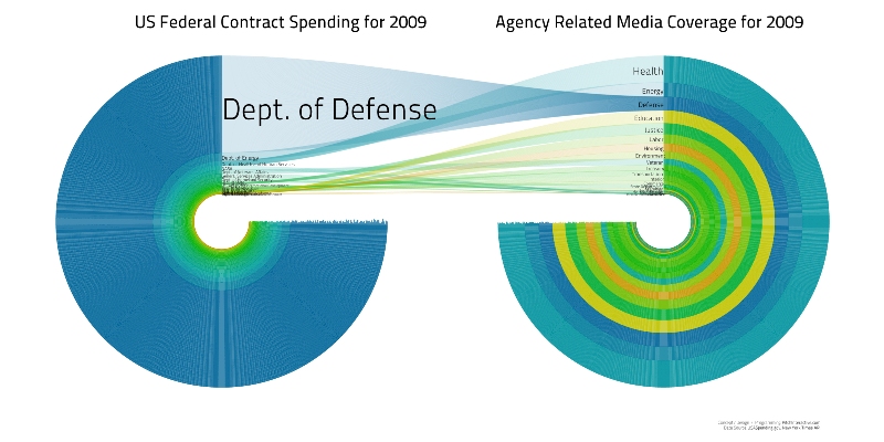
I read with fascination that this visualization won the Sunlight Foundation’s $5,000 prize for “Best Visualization Using Data about US Spending”.
This graphic is
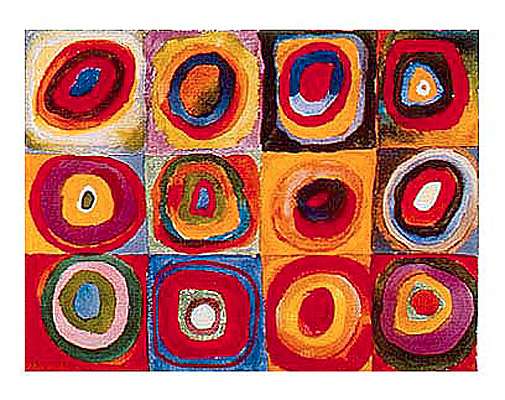
reminiscent of Kandinsky’s painting, “Farbstudie Quadrate”. I love much of Miro’s work, so I have to say that I find the above visualization “cool”, both artistically and emotionally appealing.
Unfortunately, the winning visualization is a failure when it comes to informing the public. In fact, the data in the visualization is nearly impossible to understand. Much of the available space in the visualization is uninformative for the question implied in the titles. The small space that allows comparison of the data, in the center with the white overlay for focus, is taken up with a cross-over effect, heavily obscuring the data yet again. Worst of all, there is no legend for the many colors and the values in the viz for the agency names are so small that most are illegible.
The creator of this viz responded on Stephen Few’s blog that “The real story being told here is not to illustrate exactly how much funding when into a particular agency. It demonstrates that our government spends a massive amount of money on Defense in relation to other agencies.” If this is true, then your title is doing a very poor job of explaining that point. Your viz could have stood on its own for this point with a very simple horizontal bar chart, like this one.

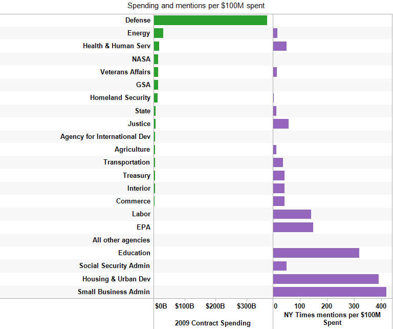
Even better, reduce the two metrics to one, like this.

Back to the original challenge, here is what the original objective was supposed to be- using a viz to inform the public about how much scrutiny various agencies receive relative to their spending on outside firms.
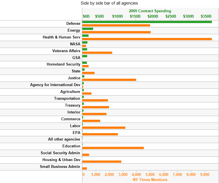
As you can clearly see, certain agencies receive very heavy attention and scrutiny relative to their spending budget. Examples include HHS, Justice, Education, Labor and HUD. Defense receives relatively light coverage for their spending levels.
My favorite way to view this data is switch from a side-by-side bar chart to a horizontal bar chart with metrics in two separate columns. Also, I replaced the number of NY Times Mentions with the more informative calculated field, number of NY Times Mentions per $100M Spent. I find this extremely compelling; you can easily see the biggest spenders in descending order and the surprising fact that the agencies with the most attention relative to the spending are the smallest agencies, like SBA and HUD.
I strongly disagree with the winners comments, “The point is that we explore compelling ways to represent information and this is one of those endeavors.” If by compelling you mean interesting but uninformative and misleading, then yes your viz is compelling. For the many decision-makers in the real-world, you have entertained them but left them uninformed as decision-makers.
Finally, the winners amusingly told Stephen Few, “I don’t think you understand the meaning of this.” I am sorry, but I am afraid that you don’t understand the point of visual innovation; it should actually improve the experience of the viewer, not just use a novel technique for the sake of novelty.
The four data views in this post required 30 minutes of data gathering and just 35 minutes of analysis in Tableau. The point of “30 minutes with Tableau” is to highlight one of the most important innovations hidden in the product, speed to insight. Many attendees of our public training are stunned at the minimal time required to achieve great insights with Tableau, with frequent student estimates of days or weeks with their current tools for dashboards created by them in our class in just 60-90 minutes.
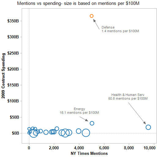
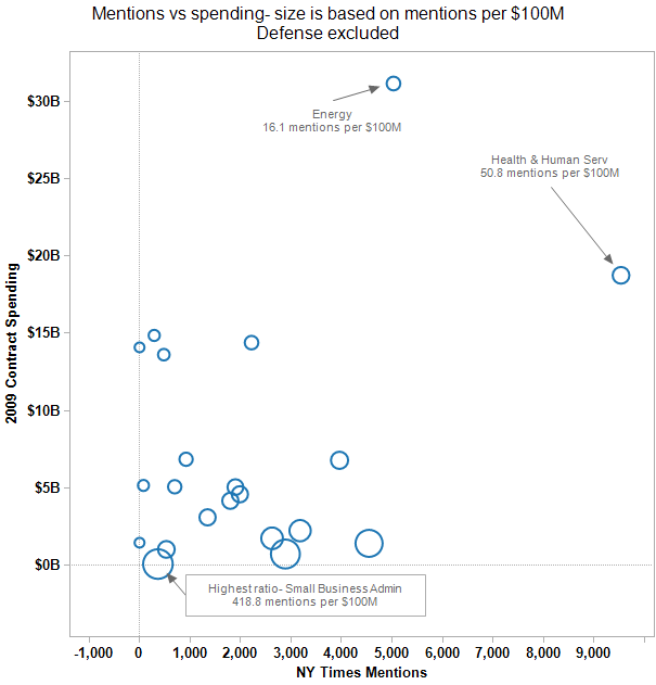
Jon made an excellent point in the comments about a scatter plot of spending against mentions. I intentionally omitted this view since Stephen Few’s web site had highlighted it, but decided to add it here as it nicely rounds out this post.
In the scatter plot, I also added bubble size based on the ratio of spending to mentions. After examining the first scatter plot, I created a second view excluding Defense. This is useful for looking at the typical relationship excluding the extreme spending outlier, Defense.
Securely share R shiny apps
Develop R shiny apps
All on one dedicated, secure and powerful platform.
