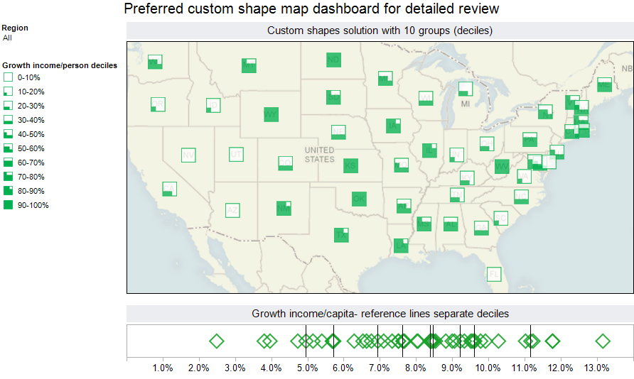
 Dashboards developed for clients frequently incorporate maps. Tableau offers quick, simple yet insightful mapping capabilities out of the box.
I have noticed that many maps used in my client’s dashboards attempt to display continuous measures. Examples include sales in the past quarter, year to date expenses versus budget or number of open sales opportunities. All of these metrics have shared issues in maps- a small range of the metric may be the dominant value in the display, making it difficult to differentiate amongst the values on the map.
In this post, I will review some common and novel approaches to mapping this type of metric.
Read the rest of this entry and view the maps and dashboards
Share the power of R shiny apps across the entire team with YakData
The team at Freakalytics has built YakData brightRserver, our new cloud platform.
Securely share R shiny apps
Develop R shiny apps
All on one dedicated, secure and powerful platform.
Securely share R shiny apps
Develop R shiny apps
All on one dedicated, secure and powerful platform.
Subscribe and keep in touch with us!