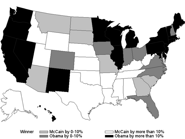
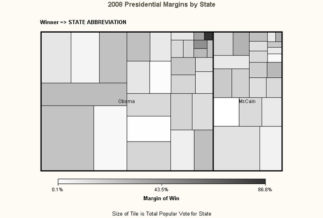
SAS 9.2 is a big leap forward in many areas. One of them is a variety of new graph types and easy access to creation in SAS Enterprise Guide 4.2. I think these two charts offer a fascinating look at the 2008 Presidential Election Results using SAS Maps and Tile Charts from the upcoming book, “SAS for Dummies”, updated for SAS 9.2 and available for purchase this Spring!
One of my favorite new examples added to the 9.2 edition of the book shows the 2008 presidential election results in two views: a map of the US with the winner by % margin of victory and a tile chart showing the state size, the winner and their % margin of victory. Due to the black and white nature of the book, these are shown in grayscale in the book and here on the blog.
2008 Presidential Election Results on a Map, Winner by State with Margin of Victory

2008 Presidential Election Results on a Tile Chart
Winner by State with Size of State as Box Size and Margin of Victory Grayscale Intensity Coded

Combined, these two offer fascinating insights into the election results. Obama dominated the Northeast, the Midwest and the West coast including Nevada. Notably, Obama added two key Southern states and Colorado to his win with smaller margins of victory . McCain’s strongholds were mainly in the Southwest and Deep South with moderate victory in Montana and the Dakotas.
In terms of the population of the states that each candidate won, Obama won the states approaching 75% of the US population. Even if Obama had lost all the small margin states, he still would have easily won the majority of electoral votes. In my opinion, these results could be a wake up call for future Republican presidential candidates.
Securely share R shiny apps
Develop R shiny apps
All on one dedicated, secure and powerful platform.