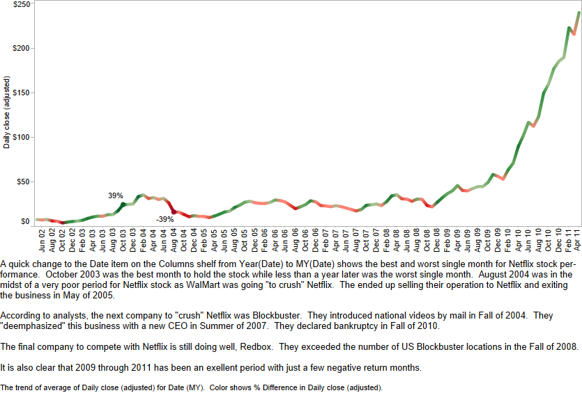
It is fascinating how much information you can uncover with just a few years of price data in Tableau. In this example, we use just two data items to examine the history of Netflix stock price (NASDAQ NFLX.) The data items used are date and closing price, adjusted for splits.
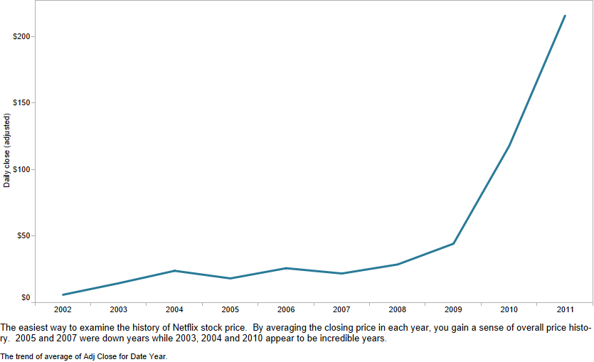
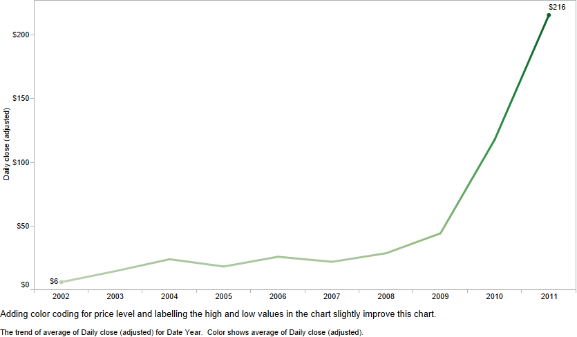
Simple annual review
Switch color coding based on year-over-year price growth
Show monthly growth against prior month, highlighting best & worst months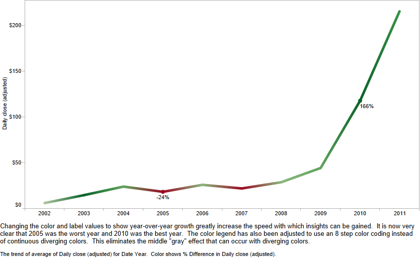
Also, several historic events are called out on this chart with annotations
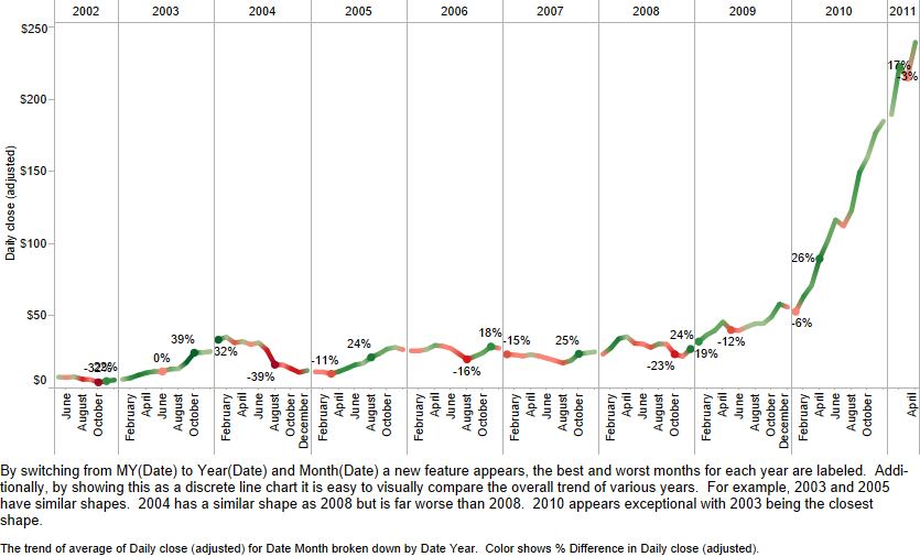
Divide the chart into annual panes
Emphasis on best and worst months each year
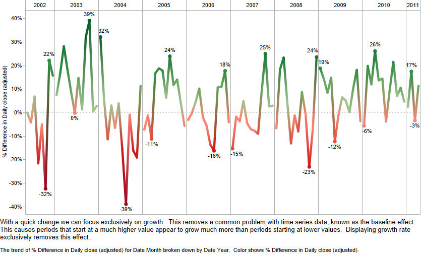
Switching to a “pure” growth emphasis
This eliminates the “baseline effect” problem
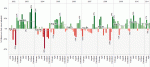
Switch from a line to a bar chart of monthly price growth
Much easier to read individual values, find outliers
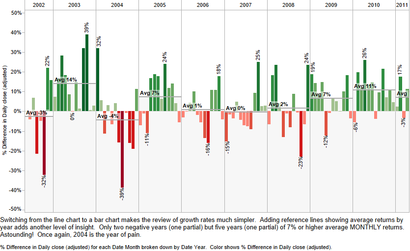
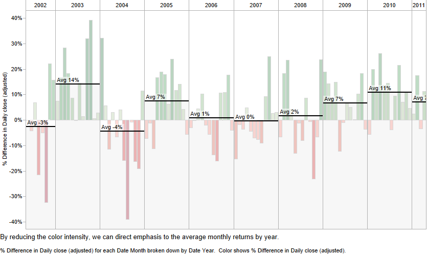
Deemphasize the bars
Emphasize annual averages of the monthly growth rates
We hope you have enjoyed this quick tour of possibilities with better ways to explore data over time. It’s all a matter of what is your question and which display approach will best inform your audience.