 Appendix #2—Build a Basic Dashboard
We’ve taught entire courses on how to design and build dashboards in Tableau over multiple days, so the topic can be quite complex. In this section, you will learn the basic functionality so you can get started. For more advanced dashboards, visit www.Freakalytics.com/examples.
Dashboard Audience
VP of Sales at a cheese maker that sells to the public and to gourmet retailers
Overall Objective of Dashboard
Sales updates for monthly review by Sales Vice President (VP)
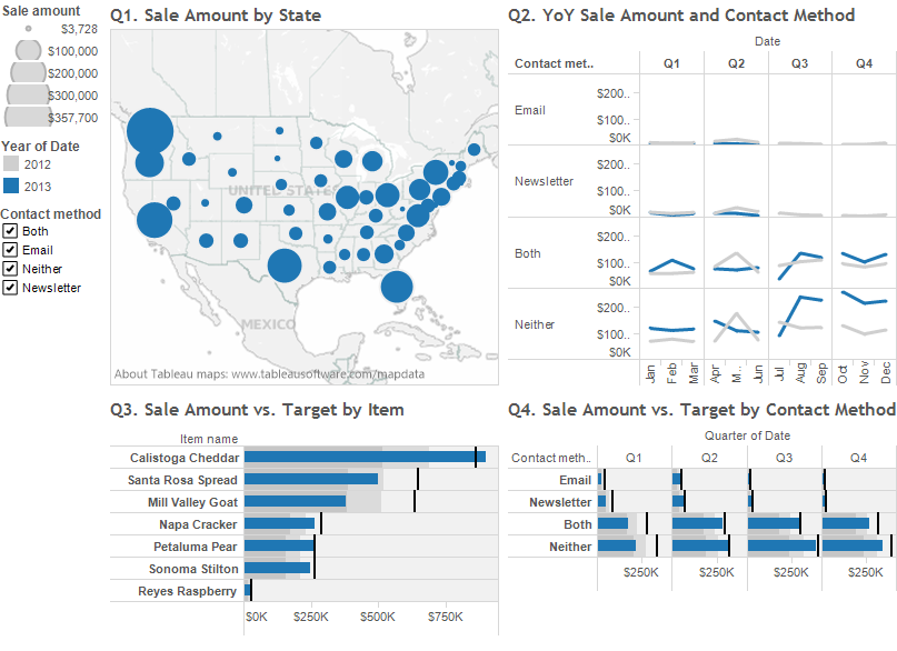
The Sales VP has four questions:
1. What are sales by state?
2. What were sales by customer contact method in 2013 compared to 2012?
3. What are the actual sales by item versus the target sales?
4. What are the actual sales by customer contact method versus the target sales?
Download the Cheese Factory sales data packaged workbook from www.Freakalytics.com/rgts8d
Included in the workbook:
• Data source contains two years of sales data for 2012 and 2013.
• Four worksheets with views answering the four questions above.
• The final dashboard is illustrated at the end of this appendix.
Build the dashboard
Open the workbook, and in any one of the worksheets, on the main menu, select Dashboard → New dashboard. In the Dashboard pane on the left side, double-click on each of the four worksheets in the numbered order. Also in the Dashboard pane, in the Dashboard Size section at the bottom, change Desktop to Automatic so the 4 views fit within the workspace. The worksheets are arranged in the order added and the legends for Q1 and Q2 are on the right.
Adjust containers
Dashboards are comprised of containers that contain the views, legends and filters and are outlined by solid lines when you click on them. First, move the legends to the left side of the dashboard.
Click on the white space under the legends and a solid dark blue container will appear along with hatch marks in the empty space. Hover at the top of the container on the dotted area to bring up the four-way arrow, and drag and drop the container to the left side of all 4 views. It can be tricky to drop the container in the right place, so you may need to practice.
You can resize any container by hovering over its edges and using the double-sided arrows. Also, depending on your screen size and computer settings, there may be scroll bars in your views. To remove them, click on the view so that the container appears, and use the dropdown on the upper right of the individual view to select the Fit option.
Create actions
You can create actions to give the user or reader the control to select specific data by a mouse-click, right-click or hover. In this section, you will learn about filters, highlighting and the actions summary.
Filters are frequently the most important action on a dashboard! The four main uses of filters are relative dates, quick filters, multi-sheet filters and using views as filters. The first three are Filters that can be created by dragging data items to the Filter shelf. The last one is an Action Filter. Note that Action Filters are different from Filters/Quick Filters, so keep this distinction in mind. Additionally, if you have the same data item in play with both Filters and Action Filters, this can cause unexpected results.
Filters
- Dates: Both years of data are shown in each view. This is correct for Q2, but Q1, Q3 and Q4 should show relative date by year (relative to today). Since this is fictional data, you’ll use 2013. Use Go to sheet arrow (square with arrow at the top right of the sheet). If you are reading this in 2013, pl0ace Date on the Filter Shelf → Filter Field [Date] → Relative date → Next → Years → This year → OK. Note that in the real world, you may have to choose Previous year or even adjust Anchor year, which you would rarely do with live data in your business. So Q2 matches the other views, click on the color legend to change 2013 to blue. Click again on the color legend to release the selection.
- Quick filters: Quick filters are the best way to give the user control. These are “Local”, which means that the default operates only on that particular view. On the Q2 dropdown, Quick Filters → Contact method. The filter appears in the left container. De-select (All) and Q2 disappears. Now select Email, and Q2 re-appears, but the other views will not update.
- Global filters: Global filters operate on all views for a given data source. Use the dropdown on the quick filter for Contact method → Apply to Worksheets → All Using This Data Source. Now all the views update.
- Views as Filters: On Q3, use Item name as a filter. On the dropdown menu, select Use as Filter. Click on Petaluma Pear —the other views will update. Press Escape (esc) to release selections, but note that quick filters aren’t affected. Check (All) on the Contact method quick filter.
Highlighting
On Q4, click on Newsletter, label or bar. Use the Highlight button on the far right of the toolbar to turn on highlighting by Newsletter by selecting Contact method from the menu. Highlighting Newsletter causes “gray-out”—other contact methods totally gray out.
Actions Summary
On main menu, select Dashboard → Actions. This displays any actions that you generated by using a menu, so quick filters aren’t included. It lists the filter in Q3 and highlighting from Q4.
Screenshot of final dashboard
Visit us at www.Freakalytics.com/rgts8 for a video that reviews major dashboard functionality. This video has an accompanying sample workbook so you can follow along at your own pace, if you like.
Securely share R shiny apps
Develop R shiny apps
All on one dedicated, secure and powerful platform.