 Let’s face it: in the daily world of work, you often are asked to provide an answer to a new problem in less than a day. Of course, your boss tends to forget about the other three project deadlines you are currently facing, so you really have only 10 or 20 minutes to squeeze in a quick and dirty analysis.
If this sounds familiar to you, this cheat sheet includes thirteen flexible steps that can take you from being clueless to looking smart in just a few minutes, with a little help from Tableau. Hopefully you’ll be able to obtain enough information to come up with ideas for an e-mail update or talking points for the unexpected meeting that is looming large over your day, showing your boss and colleagues that you can deliver great results in time to be useful.
So, if you’re already a user of Tableau, this cheat sheet will guide you to do the analysis. Even if you are totally new to Tableau, you can see the possibilities of what you can accomplish in a short amount of time, once you get started.
Download a printer-friendly version of this article here.
1 What question will you examine?
Okay, in reality this step might take hours or even days! But let’s assume you have your question, and if it is complex, break it down into several, simpler questions.
2 Grab the closest, readily available dataset that is relevant to your question.
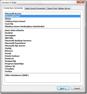
Connect to Data from the Tableau home screen.
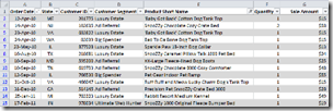
In the ideal world, your dataset is in good form, so you can just open it and move on to the next step.
If it’s in bad shape, that’s relevant information to tell your boss.
In this example, your data are ready to go!
3 Who is interested in the answers to this question?
Think about the needs of the audience. They may be interested in differing levels of detail, different metrics and different subsets of the data you have selected.
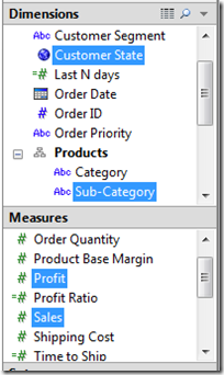
From the Data pane on the left of the screen, grab the one or two most relevant dimensions
AND the one or two most relevant measures.
(To select multiple items simultaneously, keep the CTRL key depressed while clicking on each data item using the Left Mouse button)
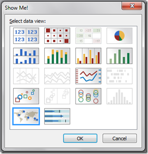
4 Click Show Me! and then OK.
This displays the default chart that Tableau “thinks” is the best chart based on the data items that you selected in the previous step.
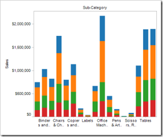
5 If Tableau selected a bar chart:
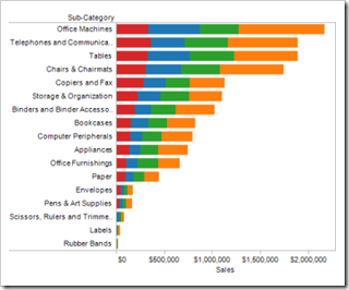
Click both the Swap and then the Descending Sort buttons (both are just to the right of Show Me!)
It is easier to read bar charts if the bars are horizontal and sorted in order from the highest to lowest amount.
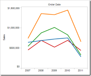
If Tableau chose a line chart with dates:
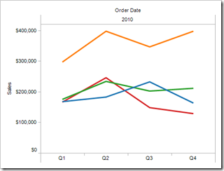
“Drill down” to the appropriate level of date detail by clicking on the plus sign on the left of the data item on the Column shelf.
Adjust these until the right amount of detail for your question is displayed.
If Tableau chose a bullet graph:
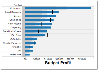
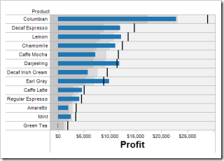
Verify that the target item (planned or forecasted value) is on the Level of Detail shelf at the bottom of the Marks card.
If not, Right-Click on the measure axis (here, the horizontal axis) and select Swap Reference Line fields.
Want more help with this step and the other 15 graph types available from Tableau Show Me!? Download our free graph and dashboard reference app here.
6 Examine the view to determine if fields should be manually rearranged.
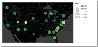
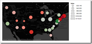
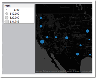
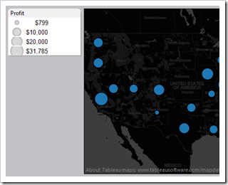
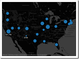
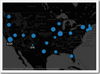
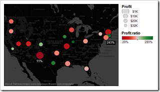
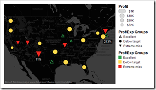
For example, if Profit is the size field on a map (in the first map, the size of the bubbles) and Sales is the color field (in the first map, the color of the bubbles), it is usually better to place values that can be negative (like Profit) on the color shelf. Reverse the location of the Profit and Sales data items on the Marks card, as shown in the second map.
In the first six steps, we have used some of the obvious features of Tableau. However, if you are new to Tableau, Steps 7-10 might be a little fancy and slower to use at first! If you can’t quite follow them, we hope they inspire you to learn more about the features of Tableau, just pick up a copy of “Rapid Graphs with Tableau Software”, at Amazon in print and Kindle for the PC, Mac, iPad, iPhone, Kindle Reader and Android devices.
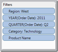
7 Examine the scope of the data: Do you need to add filters by date, place, team or item?
Drag these items to the Filter shelf and filter away!
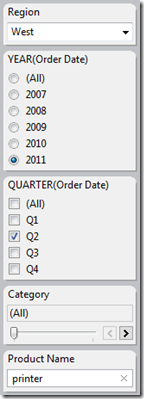
Tip: If you will share this with someone else as a workbook, packaged workbook or discuss this “live” in a meeting, then
make your filters visible as Quick Filters (click them on the Filter shelf, select Show Quick Filter.)
8 Adjust legends to emphasize your point: colors, size and shapes used matter– a lot!
Want more help with this step and better shapes, colors and sizing?
Download our free graph and dashboard reference app here.
9 Turn on labels for a bit more detail.
In the label settings, we particularly like the Min/Max, Highlighted (you must enable highlighting for this feature) and Selected options (when you click on marks in the view). To see all the wonderful label options in Tableau, click the word “Label” on the Marks card.
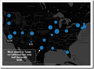
10 Annotate marks and reference lines or shapes to call out key points in the view.
Add an annotation by right-clicking on a mark and selecting Annotate —> Mark.
Add reference lines, bands or percentiles by right-clicking on a measure axis and selecting Add Reference Line.
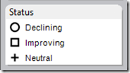
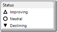
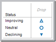
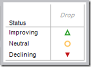
Add shapes by placing a Dimension item (or calculated spotlighting item, shown below) to the Shape shelf and then adjust the shapes in the legend. You may need to manually select Shape from the top drop-down of the Marks card, toggling the selection from Automatic to Shape. Shapes are useful at identifying performance relative to specific performance standards.
Want more help with this step? Download our free graph and dashboard reference app here.
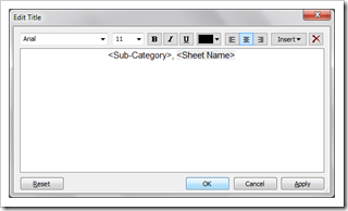
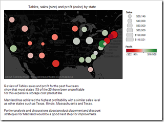
11 Name the worksheet and turn on the Title and the Caption (footnote) for the worksheet.
Adjust the Title and Caption to clearly explain what the audience is viewing, especially in the context of the question you are addressing (both are available from the Edit menu).
We like adding details about the data, data issues, key findings and our thoughts in the Caption dialog.
This is especially valuable if you are a shy speaker in a meeting, so you won’t forgot these critical talking points!
12 Repeat steps 1 through 11 another 1 to 3 times per question with alternate data items selected.
13 Save your workbook and export the whole thing as a PDF to print or e-mail to your boss.
With a PDF version of your analysis, you eliminate the potential stress of accessing your analysis in Tableau during a meeting!
Now, grab a cup of coffee and shoot the breeze with your colleagues. Be certain to tell your boss that it was a close call, but your superhuman powers allowed you to pull something together.
Recap
1 What question will you examine?
2 Grab the closest, readily available dataset that is relevant for this question.
3 Who is interested in the answers to this question? Grab the one or two most relevant dimensions and the one or two most relevant measures for their needs.
4 Click Show Me!
5 If you picked a bar chart, Swap and Sort (just to the right of Show Me!)
If you picked a line chart with dates, drill down to an appropriate level
If you picked a bullet chart, make certain that the target item (planned or forecasted value) is on the Level of Detail shelf.
If not, right-click on the measure axis and select Swap Reference Line fields
Download our free graph and dashboard reference app here.
6 Examine the view to determine if fields should be manually rearranged.
7 Examine the scope of the data, do you need to add filters by date, place, team or item? … make your filters visible as quick filters.
8 Adjust legends to emphasize your point: colors, size and shapes used matter– a lot!
Download our free graph and dashboard reference app here.
9 Turn on labels for a bit more detail. We particularly like the Min/Max and Selected (when you click on marks in the view) label settings.
10 Annotate marks and reference lines or shapes to call out key points in the view.
Download our free graph and dashboard reference app here.
11 Name the worksheet and turn on the Title and the Caption (footnote) for the worksheet.
12 Repeat steps 1 through 11 another 1 to 3 times per question with alternate data items selected.
13 Save your workbook and export the whole thing as a PDF to print or e-mail to your boss.
 Still learning Tableau? Pick up a copy of “Rapid Graphs with Tableau Software”, available at Amazon in print and Kindle for the PC, Mac, iPad, iPhone, Kindle Reader and Android devices.
Download a printer-friendly version of this article here.
Photos courtesy of Flickr.com under a commercial use license.
Securely share R shiny apps
Develop R shiny apps
All on one dedicated, secure and powerful platform.
