Stephen Few, Author, Founder of Perceptual Edge and Lecturer at University of California at Berkeley
Some comments are the opinion of Freakalytics and not
necessarily those of Tableau or Stephen Few
This content is live blogged; there may be occasional errors or omissions.
Overview
There is no way to easily weave data into knowledge…
Are we enlightening our audience or frustrating our audience?
Data and the use of data are the sexy jobs of the next decade
A video with Hal Varian at UC- Berkeley and Google was shown in an interview
– Managers should be able to examine the data themselves
– Old organizations required armies of people for leaders to see the data
– Instead, we should enable access to the data for everyone
Skills and tools
We must have good skills and good tools to achieve the possibility of data enlightenment
Bad tools can imprison us- so many tools seem to assume that we are dumb and we just want entertainment.
The Business Intelligence industry has delivered many of the tools to date
BI SUCCESS! in collecting data, cleaning data, transforming data, integrating data, storing massive amounts of data and reporting on data
BUT, traditional BI has hit the wall- we can’t explore our data, easily analyze our data, clearly communicate our findings or easily use it to predict the future
WHY@f22
Traditional BI is very engineering and feature oriented
NEW BI needs to be much more human-centric and design-oriented. We must understand how people see, perceive and use data to effectively serve them in their quest for better decisions.
Data visualization
Data visualization is powerful because it weaves numbers into information
In the 1700’s, William Playfair invented the line, bar and pie chart. He had a bad day when he invented the pie chart! Well, 2 out of 3 innovations that are useful isn’t a bad record!
Many of the new, shiny graphs are much worse than traditional, simplistic graphs at explaining the situation. This is because they misdirect, mislead and often can’t inform us.
Stephen then showed a clip from “The Onion“- concentric circles hitting misshapen areas. Parody on earthquake reporting. Lots of talk and graphs with no insights about what is actually happening in the earthquake location.
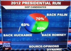
Stephen then showed a Fox News example showing supporters of various Republican nominees adding up to 190% of audience!
The process
Search, discovery, examination, understanding and making decisions. Stephen calls this Search, Examine and Explain or “SEE”
Note that vision is often our dominant sense- “I see!” 70% of sense receptors are in the retinas of your eyes.
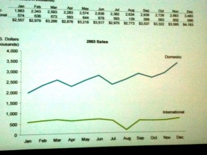
Trends, patterns, outliers- a picture makes it stand out. Can easily see patterns such as seasonality (domestic), overall trends (domestic up and international flat) and exceptional outcomes (international in August).
We should attempt to balance thinking with visual power- traditional methods put much of our burden on thinking, but evolution has made the visual system exceptional over the thinking part of our intellect.
Confused?
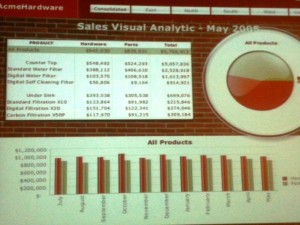
Sexy graphs are fun but often not useful or even misleading! DON”T bury the truth under layers of makeup, but rather choose simplicity in your graphs to inform.
A quote from Edward Tufte, “Above all else, show the data!“ Tufte argued that data ink should be high relative to non-data ink
1) Reduce non-data ink
2) Enhance the data ink
The objective we should strive for is to make the situation clear and simple.
An example, avoid distracting displays in your presentations. Reflections in graphs are a great example of wasted data ink. In the real world, reflections in the outdoors are something we find annoying! Why did developers build it into graph tools!?!?
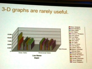
Stephen then showed 3-D bar charts shown that make it nearly impossible to read. It was a graph from major BI vendor documentation manual. They have added a third dimension when it had no meaning or purpose except to confuse.
Avoid visual puzzles- this is not a game, we are trying to make the best decision. Decisions could involve the future of your career, your company, your bonus or even people’s lives.
Save the pies for dessert, not your presentation. Also, pies on a map are useful since they are self-contained and bars or lines are not self-contained.
Sense-making
Referred to his latest book, “Now You See It“
We must bridge the gap between data and knowledge which should be built on an understanding of how we see and how we think.
What is the question@f23 Organize the data appropriately.
Stephen showed a simple example demonstrating that visual perception is not just camera work. Your eyes do NOT work like cameras! The CONTEXT influences our perception; data with poor context is misinterpreted quite easily.
A 2nd example- gradient of fill colors misleads you in bar and line charts. Then showed dots versus dots connected by lines (budget versus actual data.)
Some techniques that tools should effortlessly enable include
– sorting
– filtering
– add/remove items
– highlighting
– aggregating / disaggregating
– drilling
– grouping
– zoom / pan
– revisualize
– reexpress and
– rescaling the data.
Visual analysis at the speed of thought
See-> Think -> Modify iteration again See -> Think -> Modify and so on- the flow of thinking that leads new discovery and insights.
To achieve this we must eliminate distraction and augment our limited working memory.
An example for the University of British Columbia Visual Cognition Lab– we are easily distracted! Too much noise exists in our world of visual analysis due to poor software design.
How it works, from the World -> Working memory -> Long-term memory
Imagination can also feed into the working memory
We can only hold so much information in our working memory, 3-4 chunks of information based on extensive research since the 1950’s.
There are visual aids for working memory, so we can quickly see and understand a lot at once to aid our limited working memory. An example,
1 data point = 1 chunk
BUT one line with 24 data points = 1 chunk in working memory, suddenly you can see and easily compare 5 regions across two years instead of 5 regions for one month!
Another example, the story of three blind men and the elephant- tree trunk, snake whipping around, like a huge fan. One felt the leg, the tail and the trunk. They could only see a small amount.
Unfortunately, many data analysts are like the blind men. They have only been trained in a limited, directed way —OR— their tools impede their ability to explore and understand the data!
Where should be headed@f24 Information -> Knowledge -> Wisdom -> Which leads to a better world and life
Our ultimate goal is not knowledge, but rather wisdom. To make better decisions in the world.
Stephen then closed with a poem by TS Elliott.
Securely share R shiny apps
Develop R shiny apps
All on one dedicated, secure and powerful platform.