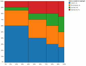
Joe Mako recently created a Tableau version of a Marimekko char inspired by an example from Jon Peltier, an Excel charting expert.
When I first saw this chart, I was curious as to the utility of this chart type for regular business decision-makers. I agree that for advanced analysts, it can offer a compact, contained means to present information across two categorical items (dimensions in Tableau) and metric (a measure in Tableau.) You can see this in the Marimekko chart created by Joe Mako in the left half of the dashboard below. When you examine the Marimekko chart you can see the dominant cities and the relative share of each segment within each city. You can also select the city names above the view to highlight a specific city. For example, you can easily discern that Almond Lovers are the biggest group of customers for this company and Delicious-n-new are the smallest group.
However, it is somewhat challenging to ascertain within Gainesville, FL which segment is the largest and smallest for this city. If you hover over each Gainesville, FL value in the original chart, you will see that two segments are identical in size; this is very hard to see without the hover values. This is due to the varying width and length dimensions for each tile in the chart.
After considering this interesting example,
