 Economic Indicators and S&P Composite Returns
from 1901-2008
A Dashboard to Explore Past, Present and Future Results
When creating a dashboard, two critical questions to ask include, “what are the right metrics” and “what collection of graphs will optimize exploration and understanding from a complex relationship between multiple metrics”? This example uses historic economic and stock market data to explore these concepts and to provide powerful insights into stock market patterns relative to economic conditions. This interactive dashboard is powered by tableau public, a new service of Tableau Software. One means of interacting with this dashboard is data point brushing, highlight data in a part of the dashboard by single-clicking and dragging your mouse across data points of interest.
Selecting the right metrics can be difficult but is a vital step to improve insight. Frequently, tradition dictates which metrics people are accustomed to receiving for a particular subject. However, these metrics could leave out vital pieces of information making the standard metrics potentially misleading. For example, many stock market discussions ignore or minimize the impact of inflation on historic returns. To understand the stock market over extended time periods, inflation can severely skew interpretation as inflation has varied widely over the past 100 years in the US.
Inflation is frequently ignored by potential stock market investors accustomed to examining results of the past few months or even years. This is due to the fact that the average investor can mentally adjust recent returns for current and recent market conditions. However, for longer time periods, this intuitive approach fails. For example, during the 107 year period available in this dashboard, you can see a very wide range of annual inflation rates ranging from -16% (deflation) to 24%. Indeed, for over 25 years the US has kept the inflation rate below 10%. As a result, it is easy to overlook the impact of inflation on historic stock returns. During some 10 year periods in this data, nominal stock market returns would need to approach 13% per year every year for 10 years just to keep pace with inflation! Due to this wide variability in inflation, the following dashboard adjusts every metric shown for inflation (excluding inflation itself!)
Another shortcoming in many recent stock market discussions is the tendency to downplay the significance of dividends on stock market returns. Examining this dashboard, it is possible to see that many years of the early 20th century had real dividend rates (due to deflation) of 10-28%! Imagine a real effective dividend yield of 28% on stocks today! Since 1990, the highest real dividend year for the S&P Composite was a paltry 1%. However, using the dashboard, you can see that earlier in the 20th century real dividend yields were very substantial for 25 of the years prior to 1955. I have added real dividend yield to this dashboard and included it in the prior year and forward years S&P Composite returns.
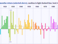
The final challenge I addressed with this dashboard is the ability to focus on the time-series pattern for one metric of interest, in the bar chart, in contrast with all available metrics in the distribution plots. To change the metric in the bar chart, just select the metric in the dropdown at the top of the dashboard. Metrics available include: recent data that would guide investor decisions- prior year inflation and real S&P returns, current conditions that would further affect investor decisions-current year real interest and real dividend rates, and the future S&P Composite returns that would be attained (including dividends) for 1 year, 3 years, and 10 years horizons.
The default state of the dashboard highlights years with 12 month prior losses in the real S&P Composite (including dividends). I created this state by dragging my mouse (single-click) over the prior 12 months returns in the first distribution plot that are less than 0%. It is fascinating to note that the only decade without a real S&P loss is the 1990’s. Examining the highlighted 1 year returns, it is fascinating to note that some of the worst 1 year real S&P Composite returns followed an earlier negative year. This dispels the myth that it is always a good idea to jump in the market following a prior year slump.
I hope you find exploring the historic data in this format enlightening and useful in your future investment decisions. The bar chart from this dashboard will appear on the cover of my new book, “Rapid Graphs with Tableau Software: Create Intuitive, Actionable Insights in Just 15 Days“. The book will be available on Amazon in July and at the Tableau Customer Conference Author Cocktail Mixer in Seattle, July, 20th-23rd! I hope to see you there!
I would like to thank Ellie Fields and Chris Stolte of Tableau for their review and excellent feedback on this dashboard. I also want to thank Robert Shiller at Yale University for the original dataset behind this dashboard, http://www.econ.yale.edu/~shiller/data.htm. Using Shiller’s dataset, I adjusted the data to create the metrics used in this dashboard. For simplicity, all calculations are based on a simple annual values approach that Robert Shiller used in his book, “Irrational Exuberance”.
As one of the first users of tableau public, we believe tableau public can be of great use to your organization for sharing public data insights!
Securely share R shiny apps
Develop R shiny apps
All on one dedicated, secure and powerful platform.