 Why don’t you just show me the numbers?
- Poor presentation of data can make informative interpretation difficult or even impossible.
- We spend years diagramming sentences & solving equations but have minimal exposure to telling stories with data!
- The ability to explore, understand and utilize real-world data is a rare skill that can dramatically improve your organization and career.
Sample revenue data from a university
| College | Quarter | Total Revenue | Tuition | Research | Plan Revenue |
| Arts | 2009-01 | $5,510,268 | $5,230,198 | $280,070 | $6,000,000 |
| Design | 2009-01 | $703,770 | $408,762 | $295,008 | $680,000 |
| Engineering | 2009-01 | $25,139,083 | $6,201,932 | $18,937,151 | $26,800,000 |
| Sciences | 2009-01 | $4,439,991 | $2,159,010 | $2,280,981 | $4,400,000 |
A prickly example

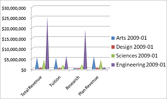
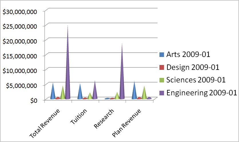
While it is indeed looking sharp, this graph is uninformative.
Perhaps I should “kick it up a notch”?

Just a few more tweaks to achieve this very colorful yet nearly useless chart.
Graph the data effectively with simple bar charts
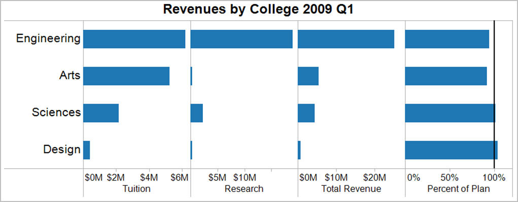
Selecting simpler charts based on sound principles of good design.
In this view, I can see that the larger colleges, Arts and Engineering, are the worst performers against the revenue plan. I can also see that the smallest college, Design, is exceeding our revenue plan.
While the Arts College tuition revenue is more than double the Sciences College, the research revenue from the Sciences is ahead of the Arts but still well behind Engineering. The net result is that the Engineering College generates most of our revenue, with the Arts College being slightly larger than the Sciences and the Design College lagging far behind the Sciences.
Adapted from Stephen Few, “Show Me the Numbers” with examples and commentary by Freakalytics, LLC. Stephen recommends our latest book, The Accidental Analyst, saying it is “a great resource for building analytical prowess.”
Securely share R shiny apps
Develop R shiny apps
All on one dedicated, secure and powerful platform.
