 Time magazine recently published a map of state budget shortfalls for 2011 by state. While this was a good attempt, I thought it would be informative to show this data in Tableau to offer additional insight. The image of Time’s map is not as clear as a regular scanned image since I used my iPhone- taking the photo on a flight!
There are three primary areas for improvement that I noted upon my quick review of their map:
1) The color legend actually emphasizes values in the middle of the range. Nevada, which has the worst shortfall, is not bright red but rather dark brown.
2) There is too much precision in their actual shortfall estimates. Does it really matter if the shortfall is 56.6%? Or would 57% be just as useful and much simpler to read, given they have shown values for all 50 states?
3) There is no display emphasizing the range of values, this is very useful when understanding how varied the different states surpluses and shortfalls are from an overall perspective.

I created this simple dashboard in Tableau in about half an hour. After thinking about it for a while, I realized additional value could be added with a regional dimension added to the view. I then updated the data to include standard census regional groups. In total, I worked on this for about 60 minutes in Tableau.
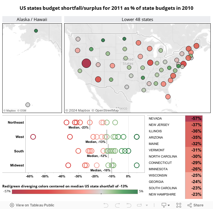
1) Notice that my color legend is centered at the median shortfall for all 50 states. The rationale is the median represents a good point of reference for how well a state is managing against their peers. Also notice that the worst state, Nevada, really stands out in the map since I also added a reverse size legend, with smaller values showing up as the biggest circles on my map.
2) I eliminated the precision, since 0.1% increments have very little meaning when the range of values is -57% to +5%. Note, the article didn’t show the actual surplus percents for the best states, so I estimated them at +5% to place them in positive territory.
3) I added a circle scatter plot of the range of values by region. I also added median reference lines by cell to show the difference in typical region shortfalls. Finally, I sorted the regions from worst to best. Surprisingly, even though the West has the worst single state (Nevada), they aren’t the worst overall region, which is actually the Northeast (using either median or average values.)
4) I added interactivity, specifically by region and state in this dashboard. To create this, you can use Edit -> Actions, Filter and Highlight Select actions.
5) I also formatted the tooltips that appear when you hover over an item. This can be accomplished via Edit -> Tooltip.
As always, I am interested in hearing your thoughts and ideas. Enjoy!
Best regards,
Stephen McDaniel