Balancing analysis of multiple years by filtering through the same month/day as today
 Topics in this example
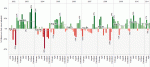
1) With a line chart, by placing Year(Order Date) on the Color shelf and Month(Date) on the columns, you can easily compare multiple years on the same pane of the graph. Just use Running Totals from the Quick Table Calculation dialog.
2) If this were real-world data, you would likely want to keep data through today; otherwise, prior years would likely be much higher since they are based on a full month while this year’s latest month is partially complete, unless it is the last day of the month!
3) By creating a calculated field that can check if the month/day is before today’s month/day and placing it on the filter shelf and selecting True, you can keep year-to-date data
Visual Analytics
Freakalytics Newsletter, May 2012
Thank you for your interest in our newsletter. Please share it with your colleagues and friends that you think can benefit from it. We are happy to share some great news, Eileen is close to the final release of our upcoming book, “The Accidental Analyst“! Look for training opportunities around the Accidental Analysts soon! Also, … Read more
Why choose Complete Tableau Training by Freakalytics?
A recent attendee’s perspective
This review of our 4 day training series was written on LinkedIn by a recent public training attendee, Danyelle. She works at the US Department of Health and Human Services as a Senior Data Advisor. I had the great pleasure of speaking with her outside of the class and was fascinated to hear how … Read more
Quick tutorial on reference lines, bands and distributions – visual analytics best practices
The following article features Tableau 6 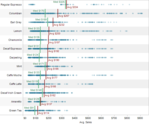
Reference lines, bands or distributions may be added to your views to emphasize particular values or areas that may be useful in interpreting your data. In particular, when comparing multiple groups or categories of data, reference lines and bands provide immediate feedback on the overall differences between the groups.
Reference lines
Reference lines are vertical or horizontal lines displayed on your view that mark requested values such as average, median, minimum, maximum, sum, total and constants (such as a line that separates the data points as being above or below a target). They can be added on any continuous axis.
1) Open the Sample – Coffee Chain (Access) data source included by default with Tableau 6
2) Place Sales on the Columns shelf and change the aggregate to Average.
3) Place Product on the Rows shelf,
State and Date on the Level of Detail shelf
and format Date to ‘MMMM YYYY’.
State of Washington government salaries from 2010, search all 160,000 employees
State of Washington government salary information is now available at WashingtonGovernmentSalaries.com. The dashboard is fully searchable by agency, job title and employee using a dashboard developed by Freakalytics and hosted by Tableau Public. Both companies are based in Seattle, Washington. Freakalytics specializes in expert, in-person analytics training and popular books on analytics. Tableau is a … Read more
Wimbledon winners longevity, by years since 1st win
small form-factor
Learn About Tableau Freakalytics is the exclusive source of the original Complete Tableau Training (4 days) and our new course, Data Management and Visual Analytics with Tableau (2-days). For a detailed review of Tableau features, pricing and capabilities, visit PowerTrip Analytics. For the Tableau Online pricing calculator, click here.
Wimbledon winners by ranking (seed) and gender, small form-factor
Learn About Tableau Freakalytics is the exclusive source of the original Complete Tableau Training (4 days) and our new course, Data Management and Visual Analytics with Tableau (2-days). For a detailed review of Tableau features, pricing and capabilities, visit PowerTrip Analytics. For the Tableau Online pricing calculator, click here.
Wimbledon winners dashboard
Freakalytics is the exclusive source of the original Complete Tableau Training (4 days) and our new course, Data Management and Visual Analytics with Tableau (2-days). For a detailed review of Tableau features, pricing and capabilities, visit PowerTrip Analytics. For the Tableau Online pricing calculator, click here.
Examining data over time, part 1- Netflix stock price history presented 7 ways
It is fascinating how much information you can uncover with just a few years of price data using visual analytics. In this example, we use just two data items, date and closing stock price, to examine the history of Netflix as an investment (NASDAQ NFLX.)
Quick reference for graph and dashboard design
Freakalytics has published a quick reference for building better graphs and dashboards. The Rapid Dashboards Reference Card has 64 tips readily available on four full-color, laminated pages. The card serves as a handy reference for yourself, your team and even your business audience during design meetings. Page 1 Excerpt, buy it at Amazon Page 3 … Read more