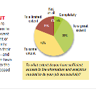
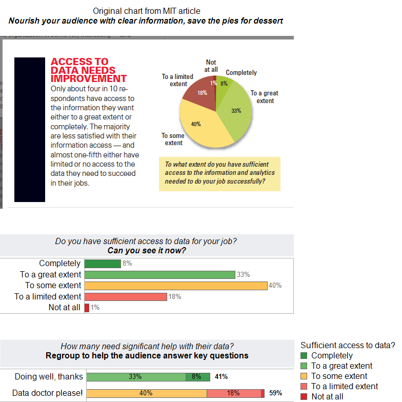
I was very interested to read the survey results from MIT about data access challenges facing business analysts. The article states that “The New Intelligent Enterprise… will allow you to do some immediate benchmarking – and see how your organization is doing in relation to your peers.” While I am certain the data from this survey can indeed be useful in meeting their objective, I am also certain that their initial chart selection makes this difficult to easily see and understand.
In an effort to demonstrate how they can make their upcoming report much more informative, I have taken a snapshot of their first chart and re-created it as a bar chart. After my initial review of the bar chart, I realized that it is likely that readers would want to group the top two responses and bottom three responses. To achieve this secondary goal, I created a second bar chart- stacked into two groups. This clearly summarizes the people who are doing well versus those needing assistance with their data needs.
In closing, I would urge the authors to consider using a tool like Tableau to present their survey results. It enables rapid dashboard development without programing. Dashboards are also dynamic, presenting your readers with easy access to all the survey results or specific subsets of the results in ways that would be impossible with static presentation methods.
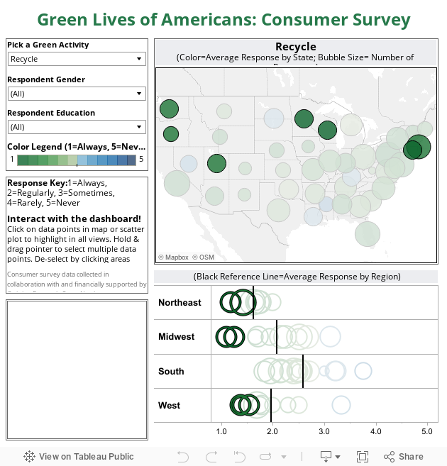
The following example of a survey dashboard was created by Eileen two years ago. She was able to enhance and reduce 80 pages of graphs and tables into a single, well-designed dashboard. This format is much easier to share with a public audience than a lengthy report and much more capable of enabling detailed review and exploration of survey results.
Freakalytics is the exclusive source of the original
Complete Tableau Training (4 days) and our new course,
Data Management and Visual Analytics with Tableau (2-days).
For a detailed review of Tableau features, pricing and capabilities, visit PowerTrip Analytics.
For the Tableau Online pricing calculator, click here.
Here is the original Green Dashboard article. For further information on the limitations of pie charts, see this article by Stephen Few. For a free graph and dashboard design reference on the iPhone or Android, see our “Rapid Dashboards Reference Card“.
Securely share R shiny apps
Develop R shiny apps
All on one dedicated, secure and powerful platform.